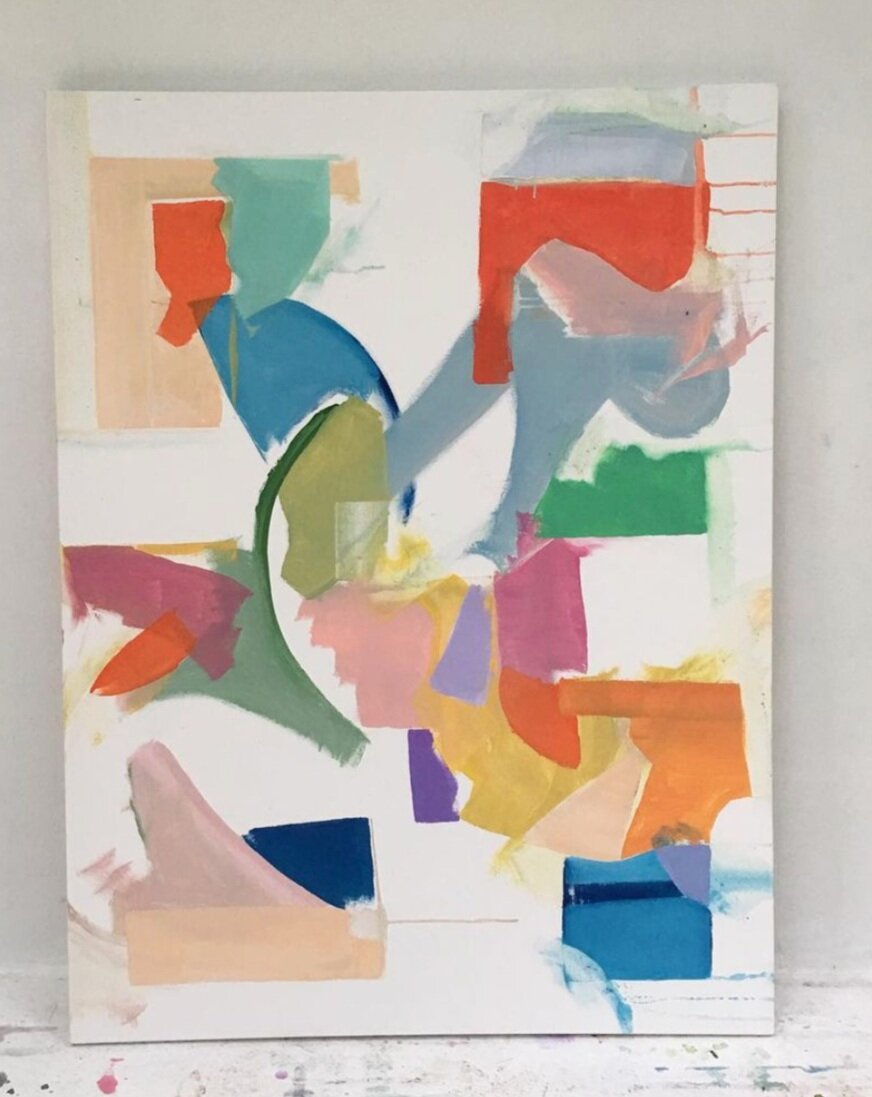
Harmonious colors, bold brushstrokes
Earthy tones
The surfboard was shaped by the artist too!
And some recent work
The artist’s paintings are at the Gregg Irby Gallery and if you’d like to follow along, he’s on instagram too.

Harmonious colors, bold brushstrokes


Earthy tones

The surfboard was shaped by the artist too!


And some recent work


The artist’s paintings are at the Gregg Irby Gallery and if you’d like to follow along, he’s on instagram too.
I recently came across this magnificent image of the Cleveland Public library in Architectural Digest, and the reference to the ancient Roman Baths is unmistakable. The cross-vaulted ceiling, the octagonal coffers… the Roman baths were the subject of my research paper, so the influence was instantly recognizable.
The ancient Baths were magnificent structures, pulsating with a rhythm of large open spaces, arches, domes, barrel vaults and cross vaults. You see their influence (built nearly 2000 years ago) in contemporary architecture time and time again. Taking it a step forward, or modernizing it, but respecting the original form.
The public baths were, in fact, a major source of pride for the citizens of that time. A place to bathe, lounge, read, gossip, exercise or relax after a long day’s work. There were hot and cold baths, steam rooms, a swimming pool, libraries, large exedras and gardens to walk the grounds or engage in debate, and gorgeous sculptures and mosaics that filled its walls and floors. A luxury club, if you will!
I thought I’d share a few drawings of the ancient Baths, and a few images of present-day architecture inspired by the Baths. Prepare to be blown away.
The ancient Baths -

The Baths of Caracalla (Rome) built nearly 2000 years ago.

The Baths of Diocletian (now a church!).
The image is a little skewed - but you can see the beautiful cross-vaulted ceiling. And of course the massive columns and the marbled floors.
Contemporary architecture inspired by the Baths -

Cleveland Public Library, Reading Room.
That coffered ceiling is awe-inspiring!

The Bibliotheque Nationale de Paris, architected by Henri Labrouste.
This is a space I would honestly never leave. It’s sublime. Love the balance between the sail vaults above, and the wood floors below. And all that light pouring in through the oculi.
Also, the photography by Thibaud Poirier is other worldly.
And closer to home…

Old Penn Station, New York City.
The scale is incredible. The windows alone were 38 ft tall (yes you read that right!) . Art historian, Hilary Ballon, rightfully described it as a place that “did not make you feel comfortable; it made you feel important.”
Sometimes keeping things simple creates the biggest impact. As witnessed in ‘Botanicae’ - the stairwell and landing designed by DZINE at this year’s SF Decorator’s Showcase. A singular vision executed beautifully.
First off, that black wall. I love it with the dynamic botanical photography. The botanicals appear to be in motion - like a graceful contemporary ballet - moving across the wall. Really pretty photography by artist Elina Frumerman.
The botanicals are all from the San Francisco area, isolated against black drops and photographed in morning light. I think painting the wall an inky-black to reinforce that, was genius! It create such a stunning impact as you move through the space. The story continues onto the landing. A visual of an expansive apple tree, right as you hit the landing. I also really like the softness of the window treatments - relaxed European shades done in white linen - a balance to all the drama around.
I’ve always been drawn to botanical art (watercolors or oil paintings), but usually with a more traditional bent to it. I love the contemporary way it’s been executed here!
I will be sharing 2 more rooms (very different from this one, but with one thing in common - each is a cohesive, unified space that tells a great story) over the next two days. Stay tuned!
You can catch a virtual tour of Showcase here. It’s open until Sept 27th and it is beautiful. A great use of lockdown time. Nothing beats being able to explore beauty from the comfort of your home.

Photograph by Christopher Stark

Photograph by Christopher Stark

Photograph by Christopher Stark
A close up of the artist’s image (titled “Malus” - the Latin name for the apple tree) by Elina Frumerman

‘Malus’ by Elina Frumerman (from the series ‘Botanicae’)

Photograph by Christopher Stark
Paying attention to the details! - the antique-y white door trim and baseboard contrasting with the black walls is gorgeous.

Photograph by Christopher Stark
With beautiful summer days ahead, and with everyone spending more time outdoors, we’re looking at chic poolside furniture and decor on the blog today. 2 different styles that you can translate to your own outdoor space, whether a pool, a patio or a deck. Enjoy!
Vibe: Boho chic with a sense of calm
Furnishings: Comfortable chaise lounges with robin’s egg blue bordered cushions and towels, shaded by a colorful umbrella with pom poms, and a wicker stool to set down those drinks! I love the casual, yet tidy vibe. And the watermelon with the softer blue is an appealing palette.

scalloped umbrellas / teak chaise lounge / outdoor pillows / wicker hourglass stool / blue spa towels / cha cha pitcher
Vibe: French Riviera with a modern twist.
Furnishings: White loungers to stretch out on, under cabana striped yellow umbrellas. A pretty lumbar pillow for added style and comfort, and a modern ceramic stool completes the picture. Love the “First Come. First Serve” pitcher by Kate Spade - a classic!

This to me is beauty. A summery Cowtan & Tout chintz paired with what looks like a supremely comfy powder blue sofa, and an antique spindle wood chair. A bright & elegant space. Designed by Amy Berry Interiors.
