ZEENAT'S PROJECTS

Giddy with excitement!! :)

Yesterday, I was down in Soquel sourcing for a project when I got this text from a client

text.jpg


I was giddy with excitement when she sent me this! (waiting in the wings, to be installed)

leather sofa.PNG
 

I love how it’s shaped up!  We custom designed it for this wonderful family’s California-casual family room.  Gorgeous lines, a beautiful leather (durable too), and the workmanship is on point.

Here’s a few pictures of the sofa silhouette. Don’t miss the subtle slope arm - a beauty. And the aged wood finish

leather sofa silhouette.PNG
leather sofa silhouette 2.PNG


I was able to source out a leather that is first of, gorgeous - a beautiful color and grain. And secondly, very durable and meant for high-traffic spaces like this busy family room.  And it was well-priced!  Leathers can get insanely expensive so I’m truly glad to have found this one & add it to my design arsenal.

Better pictures once it's installed, but I had to share a quick glimpse with ya’ll.  So exciting! And an awesome way to go into my birthday weekend :)

Fall with Flair! My Event with The Pierce & Makers Market

Last weekend I had a ball doing 2 super fun Fall entertaining events! One with The Pierce in San Jose and the other at Makers Market on Santana Row.   At the events I shared ideas on creating fresh and vibrant table settings for the season and did a live demo on how you can bring flair, color and a story to your holiday entertaining this year.  Be it a cozy meal for 4 or a lively dinner for 20!

I had a blast sharing design ideas and styling secrets with the lovely ladies that came! For intros, I asked everyone to bring / share something from their home that they absolutely love, and it was great seeing people's favorites - from an iridescent blue Buddha statue given as a gift,  to a vintage Moroccan armoire passed on from mother to daughter!

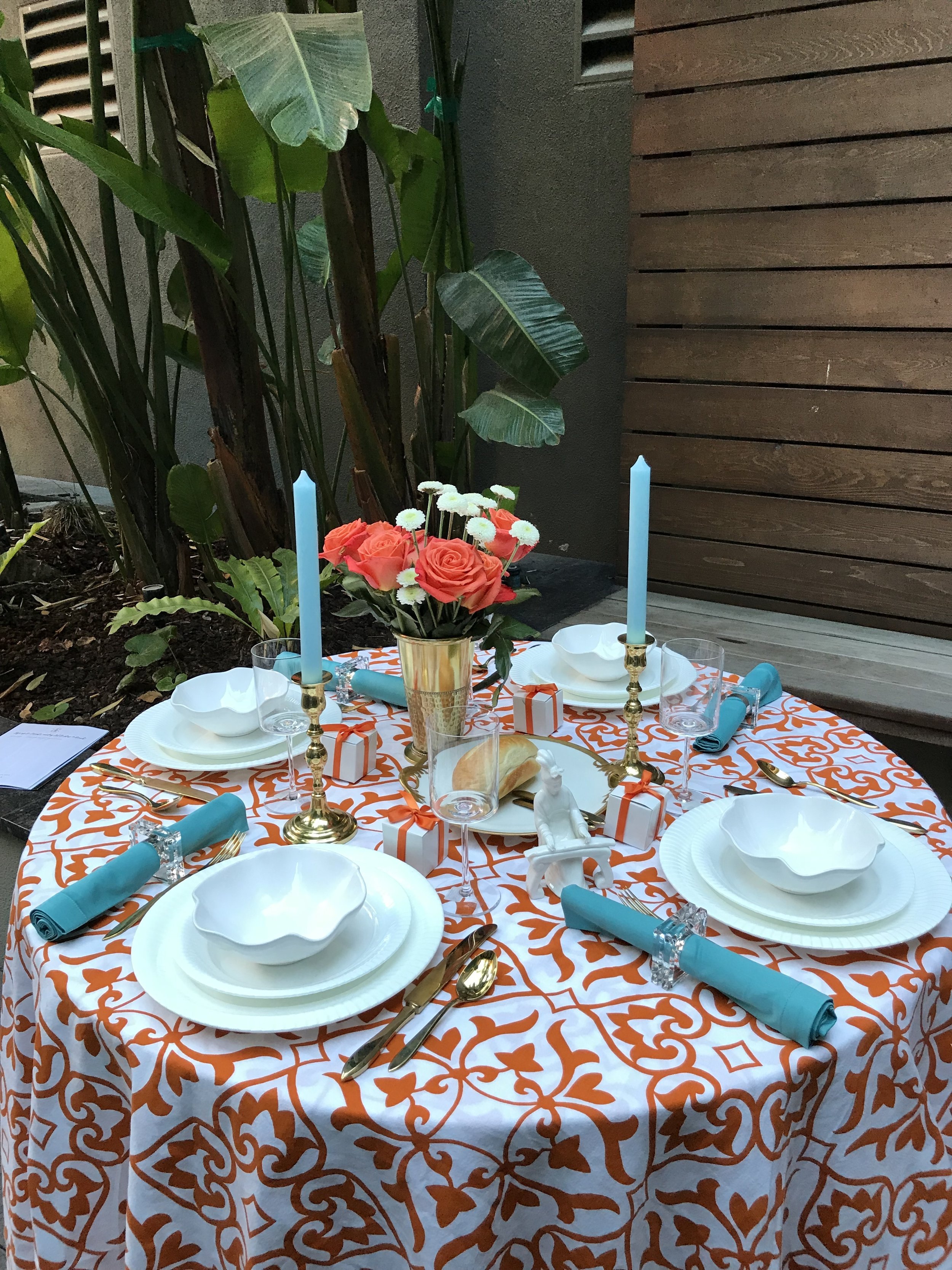
I had the best time designing and creating this festive, layered table setting. Here's a glimpse into it and some of the ideas I shared! The pictures are a mix from both days.


The perfect setting for our get together - under a canopy of trees!

 
IMG_2091.jpg


A standout table starts with a vibrant table cloth! You can get totally creative with your tablecloths - go with fabrics that inspire you. This here is a modified duvet cover. I loved the deep Hermes orange and the pattern, and felt that it had great potential for a fall table.

 
IMG_2012.jpg


Next, I added a pair of turquoise candles on vintage brass candlesticks.  Candles are SUCH an easy way to bring fresh color to your table. Experimenting with offbeat colors like turquoise, lilac, lavender, a deep pink, or even black brings that extra something to the setting.

You can change the look of your table with small adjustments! For instance, I switched the place setting on this table to take it from modern to country. I switched the pleated white plates & ruffle soup bowl from Crate & Barrel,  with vintage Perkin Hammer country-style salad plates & beautiful turquoise dinner plates!

 
IMG_2025.jpg


Going from country to a more formal, luxe look: These vintage Italian salad plates that I found at an estate sale looked amazing and totally complemented the setting.  Starburst napkin rings bring in an extra element of festive luxury  (found these super pretty ones at Z Gallerie for an amazing price!)

 
IMG_2112.jpg
 

The idea here is to MIX. Mixing a treasured vintage find with a newer purchase. Pairing brass flatware with silver or lucite napkin rings


It's all in the details!
- adding something fun & offbeat to your table makes it uniquely yours! I added this elegant Chinese figure playing an instrument that I'd found at a vintage shop. 
- little favor boxes for your guests with a delicious truffle in it? :)
- footed candy bowls to reinforce color & also have something for your guests to munch on. Fill 'em with little pieces of candy or fruits and nuts.
- glitter pine cone place cards bring in a personal touch & some seasonal charm!

 
IMG_2115.jpg
 
IMG_2031.jpg
 
 
IMG_2114.jpg


Some more place card ideas... a dandy turkey place card or small white pumpkins with the initials of your guests !   

 
IMG_2057.jpg
 
IMG_2058.jpg


Acrylic napkin rings are great when you want a contemporary feel.

 
IMG_2116.jpg


Speaking of something unique for the table, these candles that I found at Makers Market, are made from recycled bottles. I was told that the makers can make a personalized momento too, say using a bottle from your wedding. How cool is that!

 
IMG_2088.jpg


The winner of our "bring your favorite thing!" contest - wonderful Schanelle. She brought this beautiful iridescent blue buddha which was given to her as a going away gift and as a harbinger of good luck. She won the footed candy bowls! :)

 
IMG_6521.jpg


Me concentrating as I set and test it all out on day 1. Also, can I just say - I LOVED the lobby of The Pierce. It was open and bright and well lit.  The framed art on the walls were the original plans for Firestone Tire's first tire center from the early 1900s - which is what this building was many years ago. How cool is that!!

 
IMG_2049.jpg


We got super lucky with our location on day 2 as well. At the last minute we had a snafu and couldn't do it in our original spot. But then we ended up HERE!  This gorgeous urban oasis style setting in the midst of Santana Row. A huge shout out to the generous manager at EMC for making this happen. We ladies had a blast!


IMG_2089.jpg


And that's a wrap!

Drop me a comment below and let me know if you enjoyed that!   Anyone else getting creative during the holidays? How?!

Inside the San Francisco Fall Art & Antiques Show!

This week I got to be a part of the prestigious Fall Art & Antiques Show that's happening at Fort Mason Center in San Francisco. Marsh & Clark designed the booth for the fantastic Butchoff Antiques  at this year's show, and we've been hustlin' to bring it all together and create some magic in time for opening day, which was this past Wednesday!  Butchoff Antiques specializes in 18th and 19th century English & continental antiques which means I got to ogle over some absolutely stunning pieces for 2 days straight.

I wanted to give you an insider view into the whole thing. Top arts and antiques dealers from around the world come together for this event and it was a real thrill to be a part of it and play a role in making it come alive!

Here's a peak into the behind-the-scenes, and I'll share some of my favorites from the show as well.
What a fantastic opportunity to educate the eye!  I spent a good 2 hours soaking up the antiques, speaking with exhibitors and also making notes on booth designs. A lot of creativity under one roof!!  Check.it.out.


First up, the Butchoff booth. Setting the stage...cascading laser cut flowers by artist Elan Evans make for an elegant backdrop for the antiques.

butchoff laser cut florals.JPG

And here's the reveal of what it looks like after everything was set up!

butchoff booth final.JPG


This is it. A beautiful 19th century folio cabinet that had me at hello. Love the brass strapwork and  the family crest, a Bull's Head.

 
IMG_1594.jpg
 
bull insignia family crest.JPG


A tear sheet with a sketch of the antiques that we printed on vellum, to display on the cabinet. This lovely sketch was done by the talented Chiya Ewald at Marsh & Clark!

IMG_1651.jpg
 
IMG_1656.jpg


This section of the booth turned out beauuuutiful. Love the French plaque against the flowers.

 
IMG_1654.jpg


Beautiful Fall colors - flowers marking the entryway to the Festival Pavilion..

 
IMG_1590.jpg


It's all the details!  Love this greek key trim on lavendar walls that one of the exhibitors had done for their booth.

 
IMG_1659.jpg


These statuesque Italian urns were love at first sight. The handles coming up around the sides make them so unique. Love love love. 

 
IMG_1664.jpg


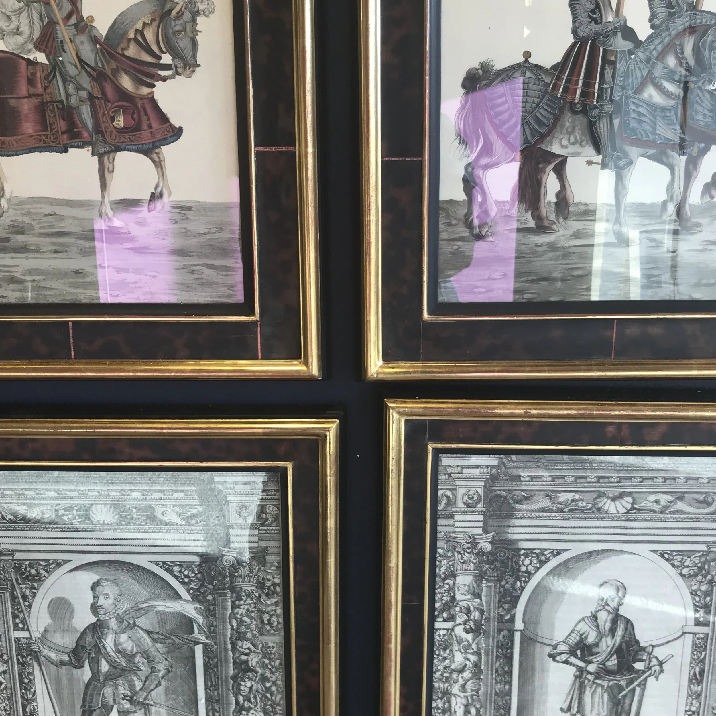
Loved the framing around these paintings. What a great choice! The tortoise shell frames bring just the right amount of contemporary to these beautiful vintage paintings.


Oriental Peter Pap rugs

 
IMG_1677.jpg


One of my favorite exhibitors at the show was Carlton Hobbs. Their pieces are extremely unique. Like nothing I'd seen before!

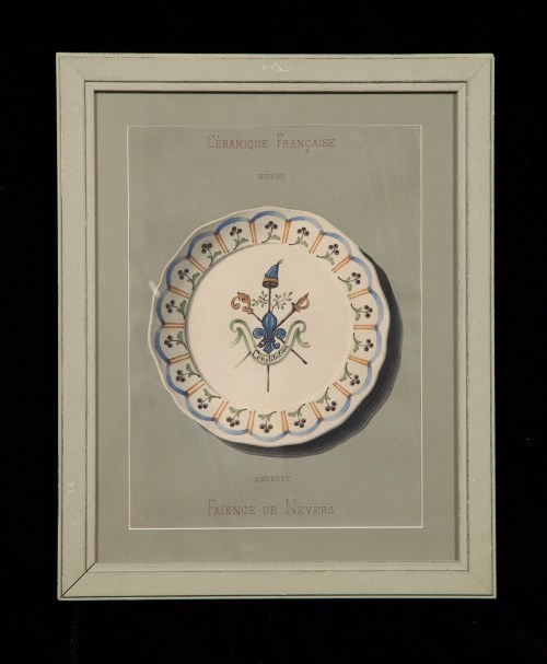
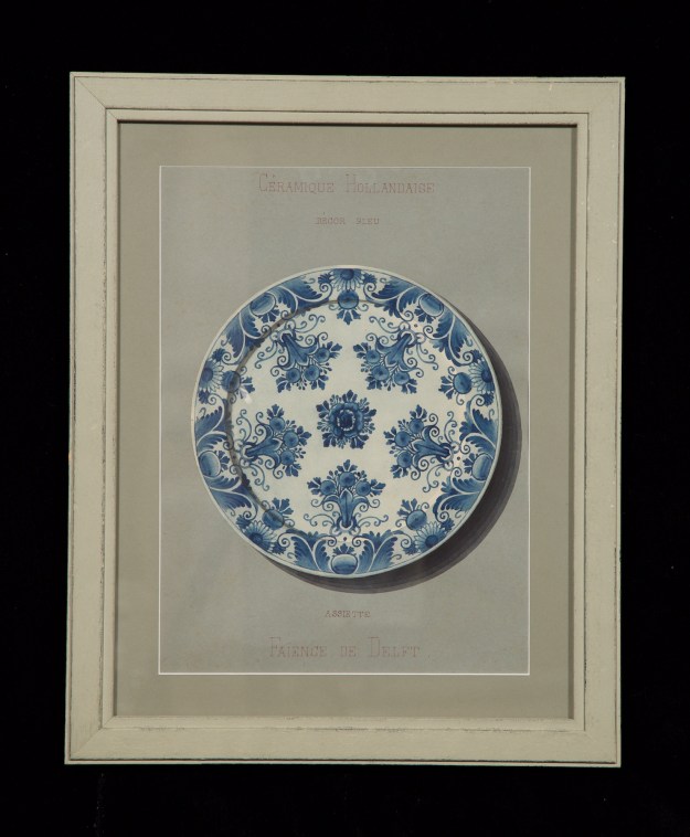
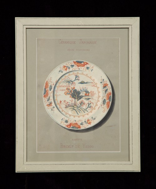
For instance, this set of 12 watercolor paintings of ceramic plates. I thought these were amazing. The way they've been painted and framed, gives them so much depth that they look real!   The shadows are painted and the circular plates have been cut and stuck on top. All adding to the depth. All of this pointed out and explained to me by their very gracious managing director, Stefania Rinza.


Also at Carlton Hobbs, these inlaid salon chairs from the 1800s,favored by Napolean's Court


And I COULD NOT take my eyes off this stunning beauty. From the Arts and Crafts period. I absolutely love the carvings and the way the chair has been painted to highlight the carvings. It looks practically regal. 

 
IMG_1686.jpg


Coming to something more recent with a little bit of glam thrown in, these Piero Fornasetti plates from the 1950s, at the Earl D Vandekar booth.  A malachite base with gold paintings of all things food and drink.

 
IMG_1700.jpg
 
IMG_1701.jpg


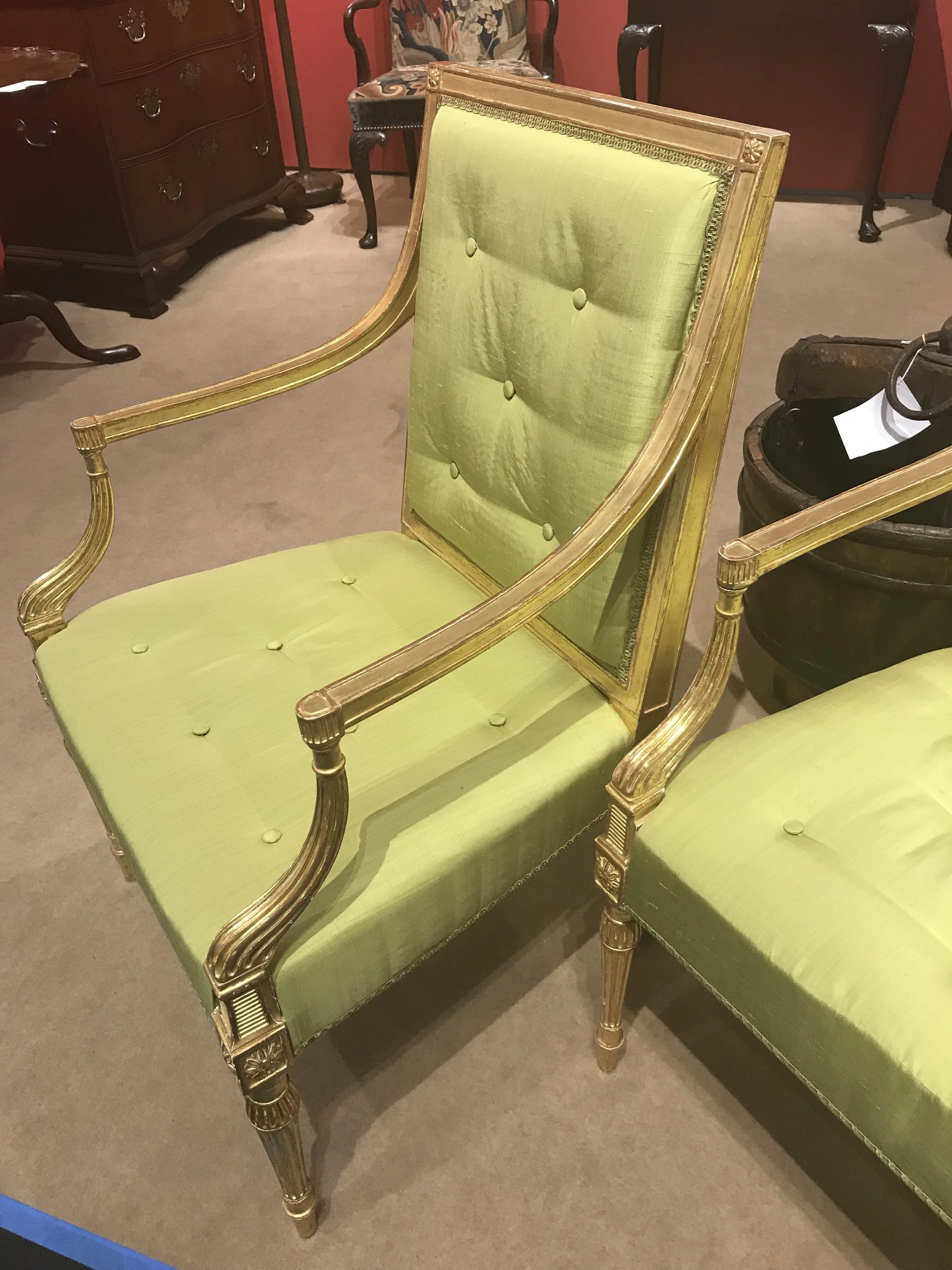
A pair of graceful gilt wood arm chairs from the late 18th century. At the Roberto Freitas booth. 

 
IMG_1704.jpg


Another exhibitor I was really drawn to was Epoca. They had some cool pieces like this geometric bottle form lamp (Italian) & these super stylish wood stools (Morrocan). Love the animal print ! 

epoca lamp.JPG
 
epoca foot stools.JPG


This octagonal table from the 19th century was such a stunner. There's something about octagonal tables that just gets me. So much style for a small footprint!


Beautiful urn at Daniel Stein


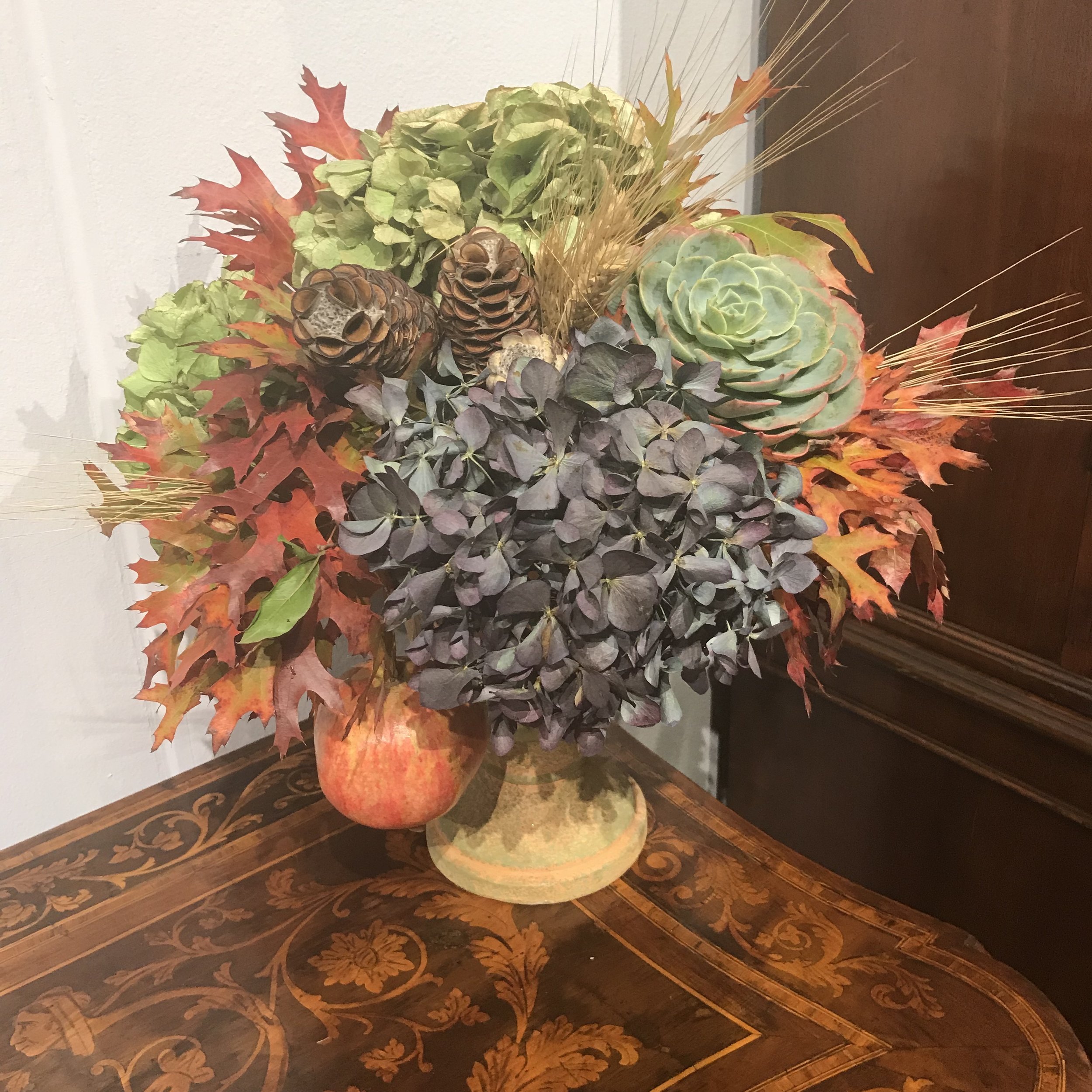
And a rustic Fall floral bouquet

 
IMG_1732.jpg
 
IMG_1733.jpg


Onto some art!

I forgot to make note of the artist here, but I quite loved this abstract.

 
IMG_1721.jpg


A slew of framed 1920s swimwear at American Garage.

 
IMG_1727.jpg


Acrylic on canvas, a Van Gough homage by Craig Alan

 
IMG_1737.jpg


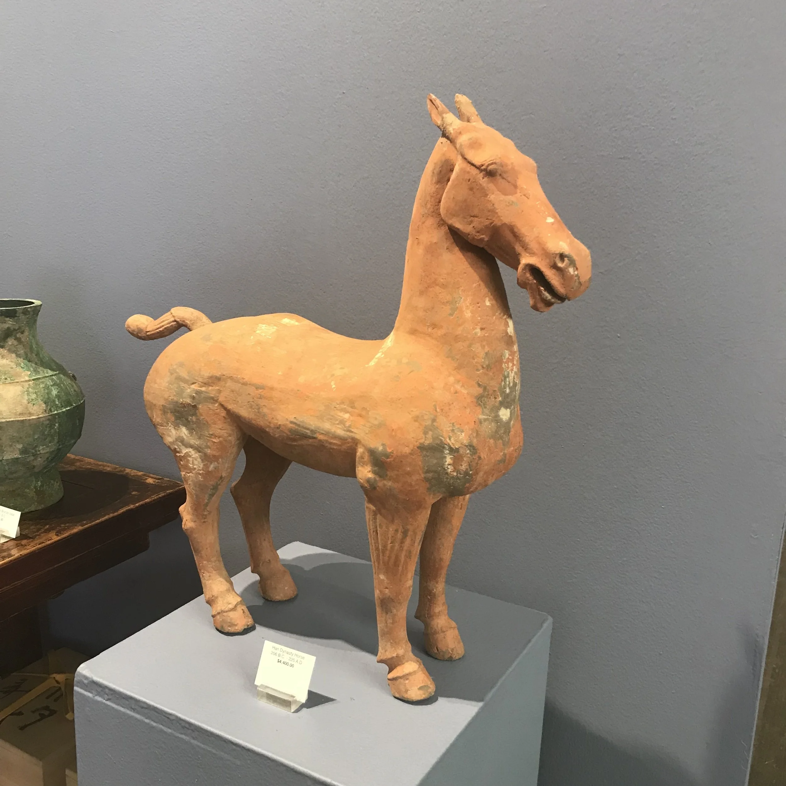
Horse art and sculpture...

left - a Han Dynasty sculpture placed between 206 B.C to 220 A.D . I'm bowing down to the archaeologists that discovered and preserved this!

 
IMG_1672.jpg
 
IMG_1740.jpg


Open mouthed  Eva Ziesel syrup pitchers... which instantly made me think of a fancy breakfast brunch I needed to be at!

 
IMG_1744.jpg


And finally, book-ending with this striking image which for me symbolizes the show. One-of-a-kind.

 
IMG_1749.jpg


The show runs until Sunday, Oct 29th at Fort Mason. It's totally worth going to and a great place to educate the eye!! And the exhibitors are super friendly too.

 
IMG_1757.jpg
 

Some News! + A Design Tip For Renters

I have some happy news to share with ya'll!  Over the next few months, I'm working with a fantastic interior design firm in San Francisco, Marsh & Clark Design. They primarily do residential design. And they've done the offices of the fabulous Chairish - a design & decor site I love for its curated collections. I'm excited to be there and to be working on projects this Fall, while continuing to share fresh ideas, schemes and resources with you here as I expand my design horizons! 

Coming to today's post - one of you lovely readers recently asked me if I had any decorating tips for renters.  When you're renting, you don't want to spend a whole bunch of money up front, but you still want to bring style into a space.  Here's an idea I like to share with people - Invest in things that are easy to carry over from one space to another.  For instance, getting some cute side/end tables.  

End tables are not a big ticket item, they're easy to move around, and they're versatile. Today they could be in your living room, a few years from now, in a bedroom. Compared to rugs, or curtains - which are pretty specific to a space, a good end table can be worked into a lot of different spaces! 


2 cute end tables under $100

under 100 end tables.png

1 / 2


I love this two-tiered glass table at All Modern. It spells glamour & style. 

 
end table round.JPG


A pair of these would look oh so elegant in a living room. 

I pulled together this look  with a very similar table in gold. Layer with flowers and books to bring in the color. And I added gold/brass tones with the deer head and an industrial floor lamp - they tie in well with the table!

end tables - scheme 3.png

A similar style table would look just as beautiful in a bedroom...

gold round end table - bedroom.JPG


Garden stools make for GREAT end tables & give an airy feel to a room.

 
garden stools.png
 

1 /  2 /  34


You could create a cozy nook in the living room or the bedroom like the one I've created below. A space to lounge, read a book or just relax it out!

cozy nook-chaise lounge - side table.jpg


I love sourcing on Etsy too for off the radar finds.

How fun is this Queen Anne end table!  It could get a new life with some paint - perhaps a light grey with antique white drawer fronts, like these ones

vintage end table - etsy.JPG


These wicker tables would make for a great alternative to a coffee table in a room that's going for a boho / beachy vibe. Soften with a linen throw and a tray.

 
wicker end tables - etsy.JPG


And that's a wrap! If you're looking for stylish additions to your home, keep an eye out for end tables. Go with something that's really calling out to you - you'll end up using it in different ways over the years.


And lastly, if you have a specific question or a problem area in your home that's bothering you, I want to hear about it! Tell me in the comments.  I'll be glad to pull in my decorating and resourcing prowess to help you out!

Christmas in July!

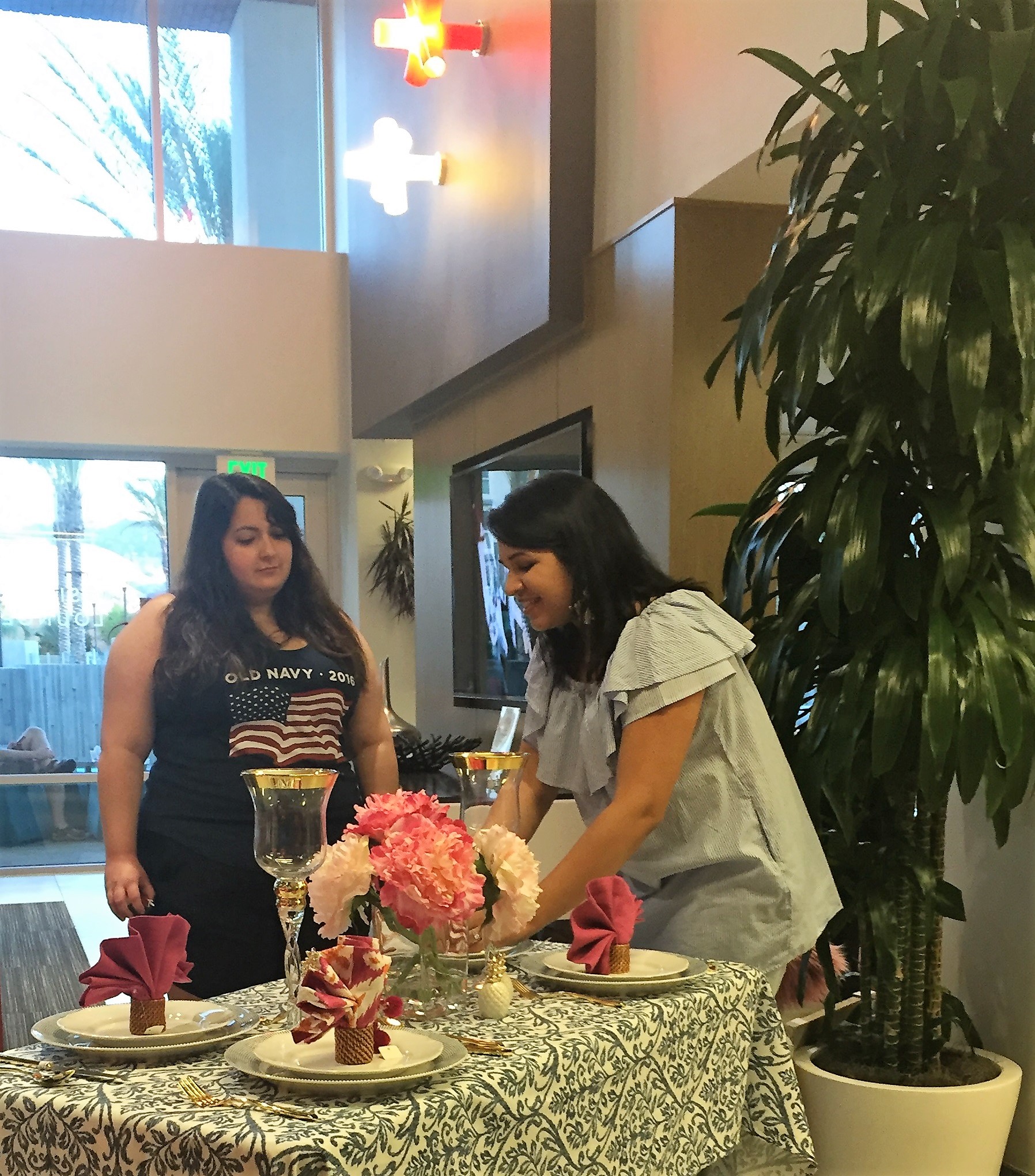
Last weekend I did a "Christmas in July" event at the fabulous Ascent Apartments in San Jose. It was such a fantastic evening with a great crowd and some really nice staff!  The property was gorgeous with this very relaxed, airy vibe to it. We did the event in the lounge that had these big, beautiful floor-to-ceiling windows that we threw open, to let the outside, inside. It was amazzzing.

I wanted to put together something special for the event and decided to go with a bold summer table setting.  When you think BOLD, you think Eddie Ross :)  You think color and mixing elements.  I decided to go with blue & white (of course!), with pops of magenta. And I had some print on print action in there too - stepping outta my comfort zone, but why not?!

Something else I wanted to do was mix traditional and modern elements. Gold-rimmed hurricanes & scalloped salad plates (which I'm thoroughly obsessed with by the way), mixed with dotted dinner plates and ikat print napkins.

Here's the reveal!


Scalloped salad plates -  from Crate & Barrel, and I saw yesterday  Target's brought em back too,
Pacific dotted dinner plates - I used these Royal Doulton ones (I got 'em at a discount!), a similar style available at Target 
Gold flatware - love this set from CB2 and this one at West Elm (well-priced).  I went with these.


Next, the napkins. I was thinking of keeping them solid since the tablecloth's printed (Ralph Lauren blue & white). But these ikat napkins at World Market instantly caught my eye and they turned out to be the right choice!  I alternated solids & prints to balance it out.

Here's a super easy trick to jazz up your napkins!  If they're looking a bit flat lying on the plate, have a little fun with 'em & fan 'em out - here's a video !  It really adds to the overall effect of the setting and it's a treat for guests.


Hands down my favorite find of the week were the hurricanes!   I love them so much. They bring a traditional-meets-modern feel to the setting and some height to the table!

 
IMG_0865.JPG


Finally, I added on these pineapple salt & pepper shakers as accents. A lot of people asked me about them!!  They're adorable. One lucky lady got to take 'em home! :P


I had a blast talking to the residents!  Folks telling me about their own spaces, and I was asked questions around decorating rentals / apartments that I'll share in future posts. Things like what's a good alternative to a coffee table? where do I find nice curtains? what should we save on and what should we invest in when decorating our place? I loved all of them & I'll sharing answers in future posts - stay tuned!  They were a very engaged community & I was glad for it!

residents!.JPG
 
residents! 2.jpg


And finally,

 
a color scheme for a living room.JPG
 

There was a nook next to my area where I put a simple scheme together. Black-n-white with dusty pink. Great for a teenage girl's bedroom or maybe even a funky feminine living room. You can mix stripes with texture. Everything's from Target - zebra print ottoman ,  faux fur pillow ,  monogrammed mug


By the end of the night I was totally ready to kick up my feet and hang out in one of those fabulous poolside pods they had on the property! :) :)

Overall it was an absolute BLAST. Thanks so much for having me Ascent! And I can't wait for the one we're doing in November!