BEAUTIFUL HOME

Lockdown Diaries Day 1: Art sets & series

With the extended shelter in place deadline, and some uncertainty still ahead, I’m starting a lockdown series and will share 30 posts over the next 30 days. Design, art and beauty can definitely lift the spirits, so here goes!

Today’s theme - Art Sets & Series. A series of prints, paintings, photographs or objects can be a great visual element in a room, and tell a great story. It can also unify and create connections between spaces. Here’s a few ideas and examples.

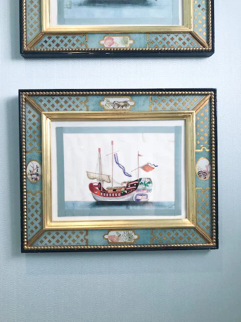
A set of (what appears to be) oriental battleship paintings spotted at SF Decorator’s Showcase last year. You’d have to see them up close to really appreciate the detailing. I tried to capture it in the closeup below!

design by Alexis Humiston, photography (above) by Christopher Stark

design by Alexis Humiston, photography (above) by Christopher Stark

 
ships .jpg
oriental ship.jpg
 
oriental ship closeup.jpg


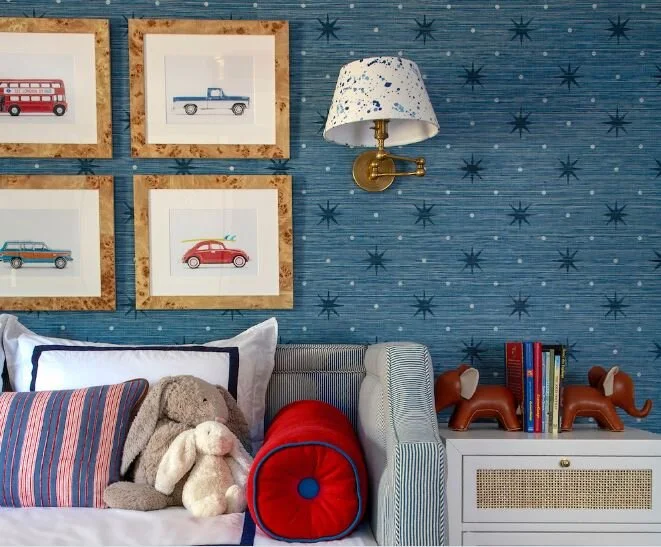
A set of vintage car prints by Leslee Mitchell, in a room designed by Erin Gates. This is her son’s big boy room and the little fella loves cars and trucks. This was a cool way to capture that in the room.

vintage car prints.JPG

Minimalist botanicals in antique brass frames

botanical gallery walls.jpg

Lee Radziwill’s 5th Ave apartment (maximalism done right!)

llee raziwills 5th ave apartment.JPG

A still life series by artist Susan Hable.

susan hable still life series.JPG

An abstract art series by the same artist. Love the archival paper & gray matting.

susan hable still collage series.JPG

A set of gentleman prints unifies the space

gentleman.png

An entry that would make you take a pause. Love the ribboned hats!

Beautiful gold medallions in this bedroom designed by Anna Burke Interiors.

floral paper art.jpg

Framed vintage Vogue covers

vogue magazine covers.JPG

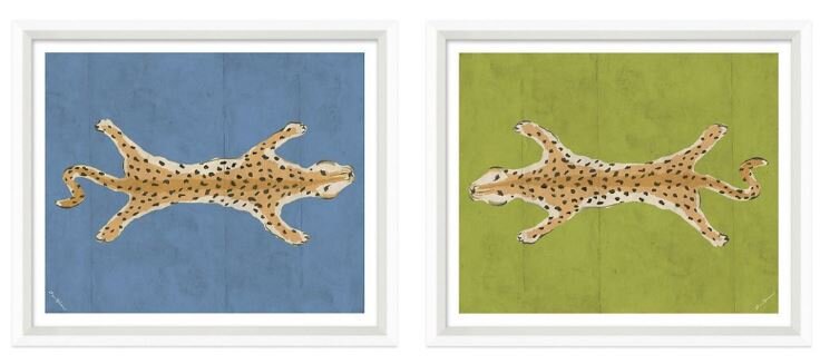
Dana Gibson’s iconic leopard motif

dana gibson - leopard diptych.JPG

Giclee watercolor portraits by Mary H Case. Love the depth of the faces!

mary case portraits.JPG

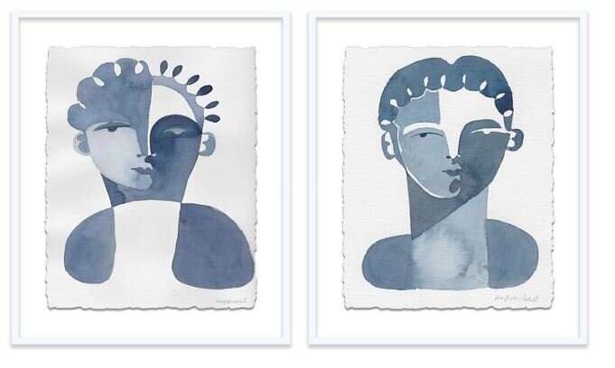
Cubist faces by Hayley Mitchell. So chic.

 
hayley mitchell.JPG
 
 
sabinien and Yves.JPG
 

A cheerful color block series by Pen & Paper Co.

Floored by It

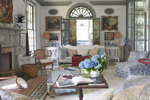
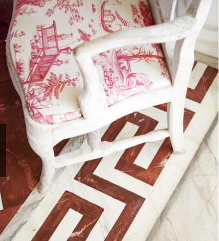
I came across the beautiful home of designer/antiques expert Furlow Gatewood  in Veranda recently. WHAT. A. HOME.  It's a home that demands close examination and I'll do a whole other post on it in the future.  But one of the things that caught my eye in these pictures were the beautiful painted floors! (close ups below).

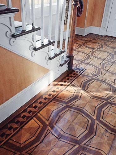
I had to explore all things painted floors & made some great discoveries along the way.  Stenciling or hand painting, when tastefully done, can give even ugly / boring floors an incredible face lift.  And for a fraction of the cost (and a relatively quick process) than if you were to gut and replace them.  Not only to cover up an unattractive floor, one of my favorite designers and design great, Bunny Williams,  uses this technique effectively to enhance an entry or a living room.

There's actually a few great options for floor stenciling on the market today & I've shared them  below.  Young House Love did  a FANTASTIC in-depth write up  on how they stenciled their closet floors (a 2-day project - pretty cool!). I highly recommend reading it if you're looking to give it a go in your home. 

In my research, I was particularly drawn to rooms where the flooring fills up the space & sets the tone for the room, without overpowering it. Sharing a few snapshots and sources below -


Greek key border floors in the home of Furlow Gatewood. I love the marble-esque texture to it (it's all paint on hardwood floors people!)

painted foors - fireplace surround - furlow gatewood.PNG
 
 
furlow gatewood - greek key 2.PNG
 
furlow gatewood painted greek key flooring.PNG


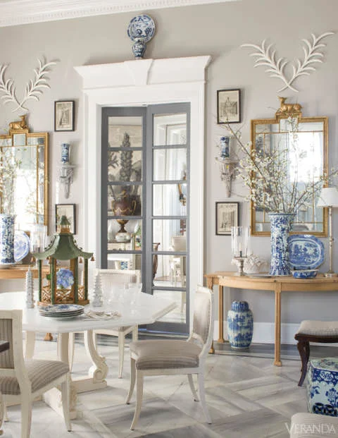
Another Furlow Gatewood vignette - someone please transport me to this room!  The painted floors, blue & white china, door surrounds, and stunning leaf decor - I know we're talking floors here, but man, just look at this room.

Furlow-Gatewood-Veranda-.jpg


Something  more contemporary - this trellis pattern  by Anna Louise - she transformed "depressing dark vinyl floors" into THIS.

Stenciled flooring.jpg


Stenciling  in progress (they've used a brush, and I've seen small paint rollers used as well)

stenciled flooring in action.PNG


A checkered entry - Bunny Williams

bunny williams painted floors checkered.PNG


A tortoise shell pattern that Bunny designed for an entry

stenciled floors bunny williams.jpg


Geometric floors in the kitchen - a great choice of color in that silvery grey

light grey diamond pattern - subtle flooring.PNG


Mirth Studio makes beautiful hand painted hardwood tiles. How fantastic are these! Lots of fun patterns & colors and they create custom designs as well.  The little helper to the right - came across on their Instagram

 
mirth studio handpainted tile choices.PNG
 
mirth studio handpainted floor tiles - little helper.PNG
 
mirth studio handpainted wood floor tiles.PNG


Some whimsy up the stairs! 

mirth studio painted stairs.PNG
 
mirth studio painted stairs 2.PNG


I love this room and it's blue floors.

Bunny Mellon - painted floors.PNG


For some pretty, traditional patterns, take a look at Royal Design Studio

 
royaldesignstudio blue & white.PNG
 
royaldesignstudio floral.PNG


Have a great weekend everyone!

Design Crush Tuesday: Paloma Contreras

I came across this beautiful, happy bedroom on Pinterest the other day and instantly wanted to find out who it was designed by.  It's the work of Paloma Contreras,  an award-winning designer based out of Houston and the founder/curator/writer of her wonderful blog, La Dolce Vita. Her work seemed familiar but I couldn't  quite place where I'd seen it before... and then I remembered - it was on postcard I'd picked up at deGournay a few months ago.  It turns out, I've loved her style for a while now! :)

 
de gornay postcard.jpg


Looking at room after room of her work, I found myself saying, "Holy smokes, this is gorgeous!" at least 20 times!   They're tasteful and textured.  Sometimes formal but never fussy. A play on patterns. Comfy but not homely. Gorgeous vignettes!  And a BOLD use of color. And they seem to have a quality to them that says "these are real, livable homes for real people" , and not just clicked for a magazine spread (although she's been featured in quite a few of them! )


A happy, cheery bedroom. Every time I see this Katie Ridder wallpaper I'm more in love with it - it serves as a beautiful backdrop to this bedroom! The suzani pillows are a winner too.

bedroom.PNG


Want to liven up a basic white pinboard? Add a nailhead trim to it. Love it!

vignette.jpg


Normally, I wouldn't be a fan of matching shades and throw pillows, but here, somehow, it just works! I think all that natural light, the large window and the surrounding white, balances of the pattern and colors and makes it all come together really well.


Love the arched entrances to the rooms, the columns and the mounding. Don't miss the fantastic antique side/end tables!

 
westsideforesthouse_may2014-277.jpg


A lovely vignette. 

 
westsideforesthouse_may2014-312.jpg


A small but grand bathroom.  It's moody, it's luxurious. Paris flea market chandelier, anyone?! :) And that console sink is va-va-voom gorgeous.

westsideforesthouse_may2014-405.jpg


082916_PalomaContrera_1.jpg


If one is ever to pick a taupe-ish brown wall color for a room - let this be it!! 

The striped curtains, the headboard and the pillow choices (a Schumacher fabric on the square pillows) are all fabulous. 

 
bedroom.jpg
 

Mitchell Black

I hope everyone's had a great start to their week! 

I just realized it's been a while since I've shared a wallpaper post on here! I discovered this cool new wallpaper source, Mitchell Black, over the weekend and instantly wanted to share it with you guys. I've been pottering around their site all week & they've got some really fresh and fun designs.  What's great is that their wallpapers are peel-and-stick (aka removable wallpaper).

Wallpaper has made a major comeback in the past couple years... it's ascended from "grandma's house" status to being totally chic. A great way to make a bold statement or set the mood of a room. Removable wallpaper works well in places where you want to get the look but without the commitment. And it looks pretty darn great too!   An accent wall? Kitchen backsplash? The kids' room?  These would be perfect.  I think the key is to go with quality paper & to hang it as smoothly and carefully as possible (here's a great tutorial by Apartment Therapy that explains how).  I like Mitchell Black's mix of designs - funky geometrics, uber feminine florals, whimsical patterns inspired by vintage Asian / African/ Australian textiles, and vibrant monochromes - they have a little bit of everything! Check 'em out.

mitchell black dusty yellow heartbreaker.jpg
 
mitchell black stalking tiger black moss.JPG
 
mitchell black tasmanian sand.JPG
 
mitchell black dusty yellow.JPG
mitchell black heartbreaker royal.JPG
 
mitchellblack abacus.JPG
 
mitchell black faceted graphite.JPG
 
mitchellblack turkish rose.JPG
 
mitchell black wallflower lilac.JPG
mitchellblack fanning out mint.JPG
 
mitchell black moody.JPG
 
mitchellblack_drama.JPG


I'm kinda sorta obsessed with this antelope sketch! Talk about DRA-MA.

mitchellblack drama 2.JPG


It got me peeking into their Wall Art section.  Some really great finds here too. How fantastic is this swimmer series (splash, dive, in the air)  & the letterpress key!

mitchell black wall art.png

Statement Pieces

One piece of design advice that has really stayed with me (this one from the inimitable Erin Gates) is this - pick one item you absolutely, die-hard LOVE, something that makes a statement or has an interesting shape or color, and build the rest of the room around it. It's really good advice.  

Right now there's 2 things I'm in love with that I feel make for great design elements in a room.
 

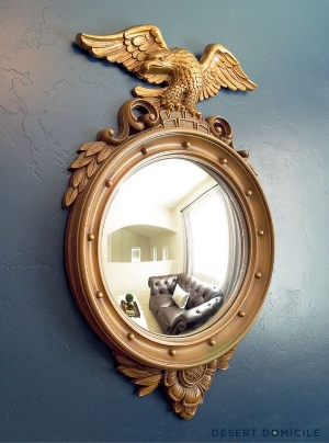
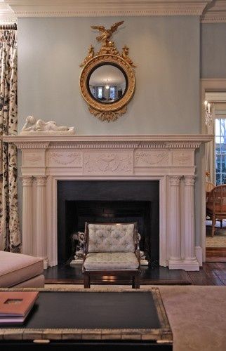
1. The bold & beautiful federal eagle mirror.  It's definitely statement-making and so so versatile. 


You can put it above the fireplace, in an entryway....


Up the stairs... literally place in anywhere, and it works. It just takes the space up a notch.


2. X benches! They're such an EASY way to bring some style into a space. Especially smaller spaces like an entryway (and they serve a purpose - sit down and wear your shoes people :P)  They're great in the living room too for some extra seating, apart from being so visually interesting.

I love, love these malachite pattern X-benches designed by Erin Gates (from her book Elements of Style). Never get old to look at. Aren't they stunning?


x benches banana leaf.jpg


And here's one that has both my favorites in one place! 


What do you think? Any of these call out to you? :)


Image Credits: Desert Domicile,  Haus And Home, Cup Half Full,  The Gathered Home, Element of Style,  Laurel Home,  Bright on the day, No 29 Design