I recently took a Masterclass with Kelly Wearstler which was both fun & useful (especially her lessons on materiality, and using the history and surroundings of a space, to influence its design). You need only glance at Kelly’s portfolio to get her amazing sense of materiality, space, storytelling, and her ability to combine objects in ways that feel new to the eye. Her projects are her playground, and Kelly it’s master conductor.
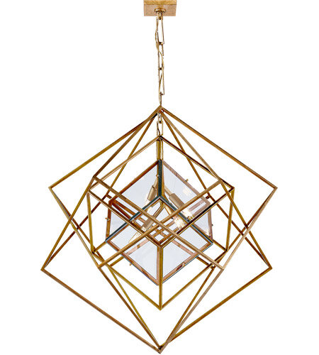
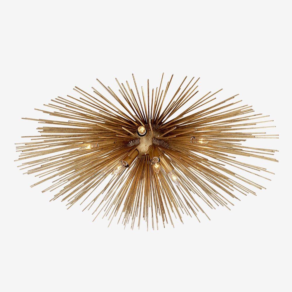
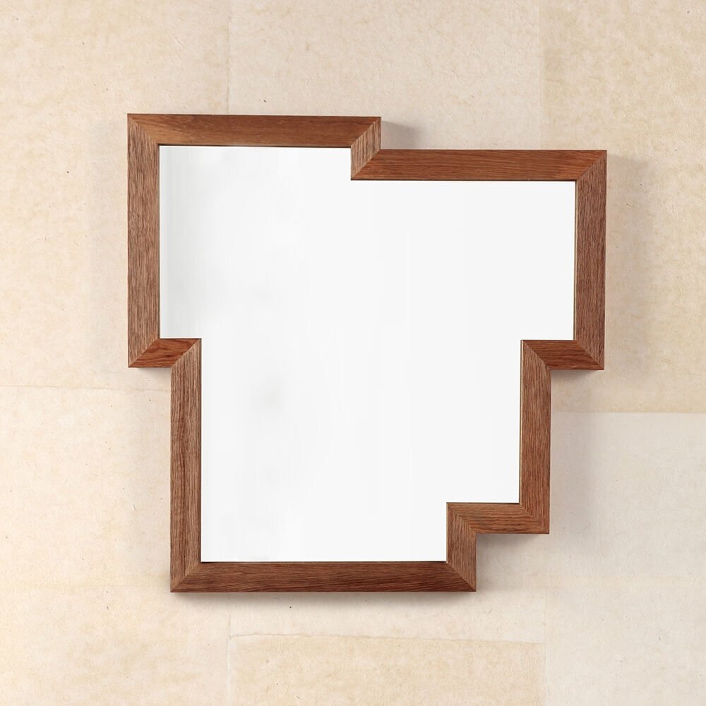
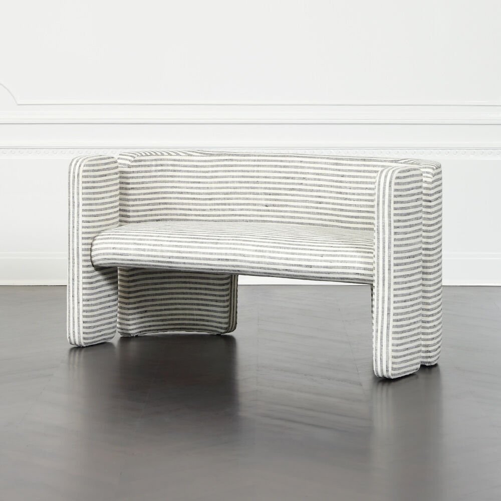
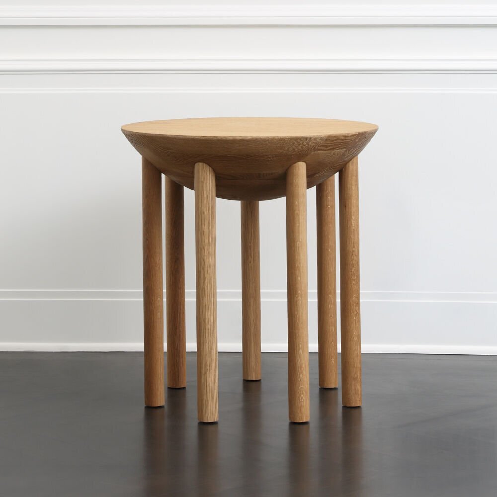
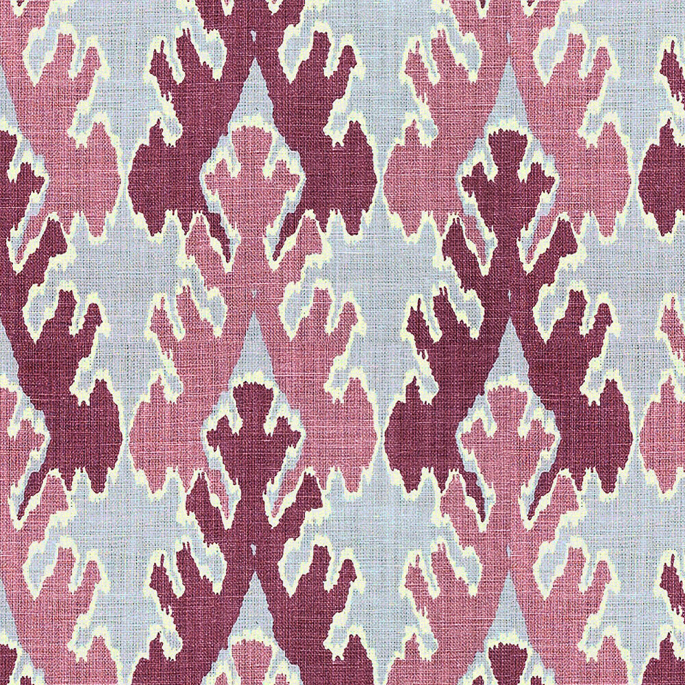
I’ve pulled a few vignettes from her portfolio that are inspiring to me, personally. And I’ve pulled a few favorites from her product lines as well. Particularly, wallpaper, fabric and lighting. They feel personal to her, and break through the clutter. Enjoy! :)
Love the eclectic mix of objects in this room. Feels like a collected space.
An oldy but a goody - her iconic brushstrokes wallpaper in this dynamic foyer. I realize it’s a little “out there” and it may not be everyone’s cup of tea (may be too “on the edge” for me too on most days), but somehow I really like it here in the stairway - its a risk that pays off, I think.
via Vogue
The Bergdorf Goodman restaurant overlooking Central Park. Elegance personified. Inspired by salons of the past. Love the powder blue and white colo scheme.
The Viceroy Hotel, Santa Monica.
I LOVE this wall of mirrors! Its commanding. And the oversized cameo and emerald chairs. They make a statement at the front desk.
OK. This. Is. Everything. The mural of white plates & furnishings against the charcoal backdrop is STUNNING. What a visual!
A more recent work - the Proper Hotel in Santa Monica. She went with organic materials and vintage pieces for this relaxed, beachy hotel.
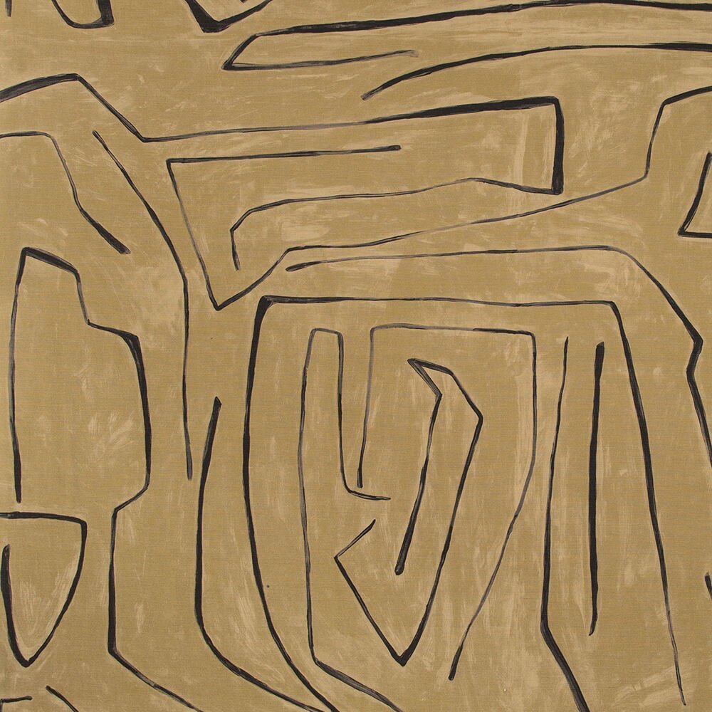
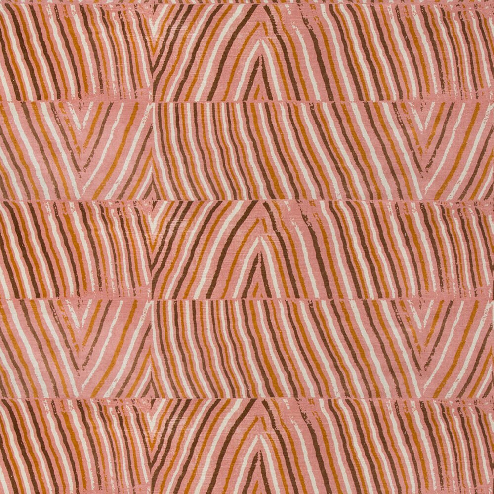
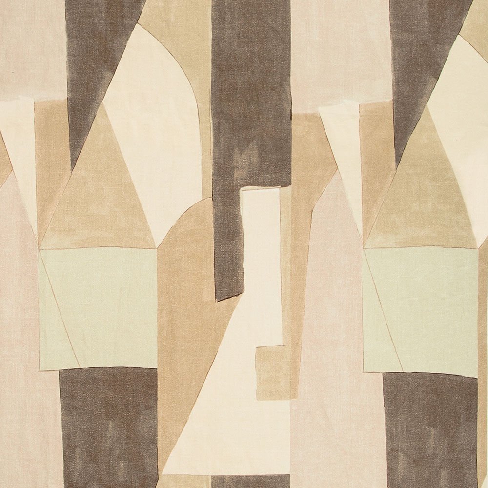
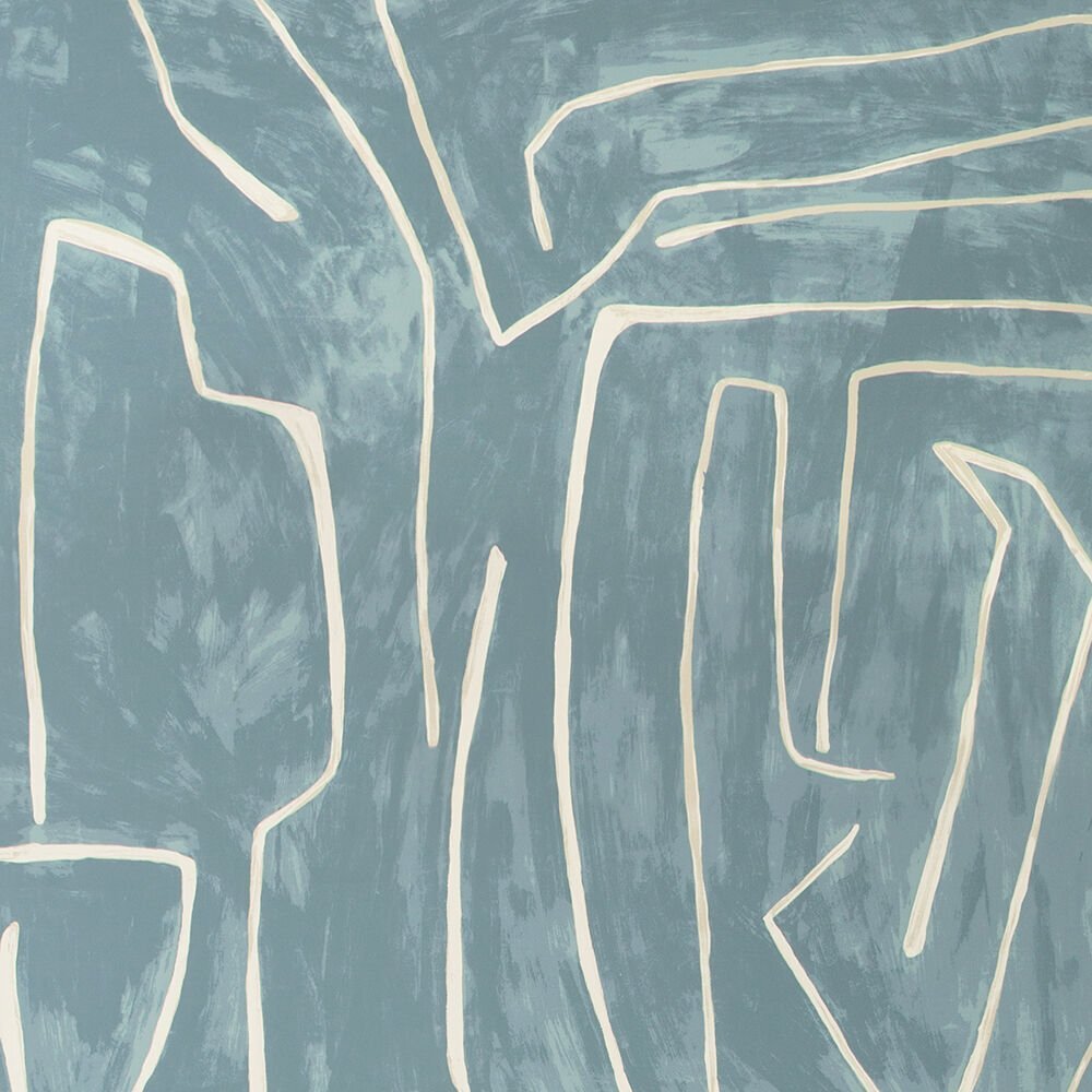
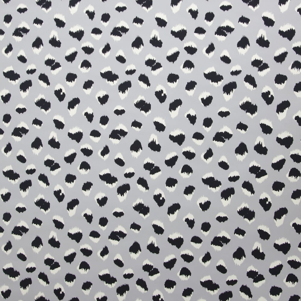
From Kelly’s product collections. Love the organic nature of these patterns.
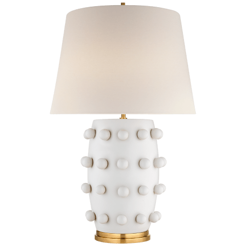
More from her product lines below! You can see it all here.


