You guys, I’m excited to share this project with you today - a recent bedroom design I worked on for a sweet client! She’s a lovely young lady with a zest for life and wanted to transform her bedroom into a beautiful, inviting space. We worked on it over the fall and I finally have some good pictures to share with you. Thank you to her for being a total rockstar as we had to shoot the room twice due to lighting snafus. (seriously, you're awesome.)
We wanted to make the room a cozy, comfortable space for her, without compromising on style. It needed to feel chic and exciting. Based on our discussions and the inspo images she shared with me, here’s a few things I kept in mind when designing out her space
reflect her personal style (eclectic-glam)
bring in elements that bounce off the natural light in the room (mirror/reflective surfaces)
a comfortable bed & mattress
a desk to browse or catch up on work
smaller storage pieces in addition to the closet already in the room.
lightweight seating for when friends visit
Overall, she wanted it to be a bright, happy space she can look forward to coming home to everyday.
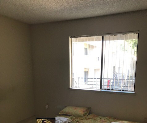
Here are before & after pictures!
Before
After
I love how it’s shaped up :) A fun, cozy space for her to retreat to.
Love the ikat pillows. They were the first element I pulled for the room, and became the jumping off point for the rest of the scheme. The sunburst mirror and stacked ball mercury glass floor lamp are great for bouncing off the natural light entering the room.
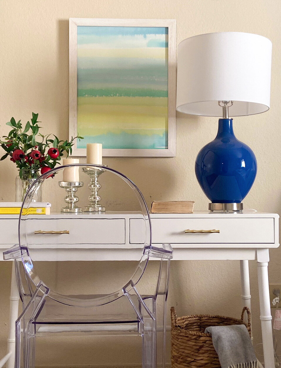
A chic white desk serves dual purpose - as a bedside table and a workspace. I really like the details on the desk - faux bamboo legs and brass drawer pulls. The lucite chair complements the desk perfectly & proved to be comfortable for her too.
A light grey diamond pattern rug to ground the bed.
One of my favorite finds are these pretty masonry gray curtains. They make the room feel cozy & the fabric has a subtle glint to it which makes them look expensive.
2 good rules when hanging your curtains: 1) hang them as close to the ceiling as possible (this adds height & can make the room feel more spacious) 2) leave about a 10-12” gap on either side of the window when hanging your panels (this allow for as much light as possible to enter the room when the curtains are open).
My current obssession (ikat pillows)
The scalloped headboard with the nailhead border is a winner. The bed is a great place to bring in interesting detail.
And finally, we added touches of fall throughout the room, as it’s her favorite season!
A tasteful arrangement of white pumpkins, bay leaves, berry branches & a vanilla pumpkin candle by the window. And pomegranate and berry branches in a vase on the desk.
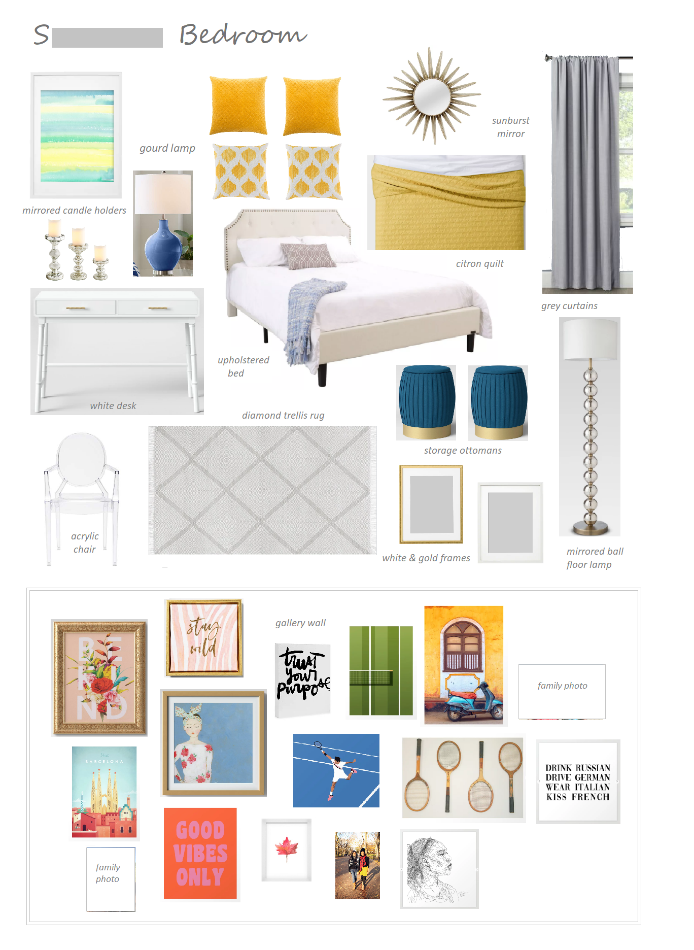
We also created a gallery wall to go up on the wall facing the bed. It includes all the things she loves - sport (particularly tennis!), travel, adventure, and of course, pictures of family and friends. She is going to piecemeal it out, and buy and install the frames over the next few months.
Here’s the scheme that was presented. (naturally, like any design process, a couple of items ended up changing a little)
I couldn’t be more excited with the way this room has shaped up. A huge shout out to her for being a joy to work with - decisive & trusting me with her space. We are both thrilled with the outcome :)
I hope you enjoyed this post. And if you’d like to have me design a room like this for your home - I’d love to. Please email at zeenat.arsiwalla@gmail.com for more information.


