Decorating a home for sale

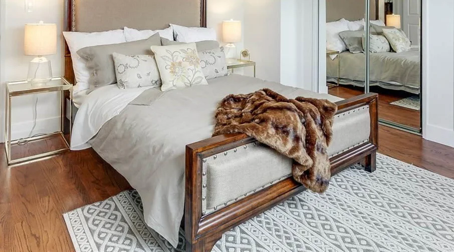
Last month I was part of a team (led by Cynthia Holiday at Holiday Inc & Elise Marie at Exp Realty) that prepped & decorated a beautiful, 4-bedroom family home in Fremont for sale. The house is in a DREAM school district, so it's hot property right now.  We were charged with getting it updated & furnished for open house in a few weeks!  It was an INTENSE few weeks, but we pulled it off :)  

Sharing a few glimpses with ya'll here!

You'll see lots & lotsa neutrals (albeit with lots of texture)  and that's because when decorating a home for sale - neutrals are your friend. Whites, greys,  gold tones - but of course, you can have some fun with texture.  We kept the walls simple & painted them flat white and heron gray.  Sometimes a polarizing wall color could put someone off the entire house, so it's best to stick with neutrals when it comes to this. Also, it opens up the space and makes it more inviting.

Photos are a combination of my own and those taken by the real estate photographer.

My favorite feature in the house? The BEAUTIFUL bay windows, hands down.

If you or someone you know is interested, please pay a visit. The listing is shown here.

 
IMG_4672.jpg
genMid.40823267_17_0 edited.jpg
 
genMid.40823267_9_0.jpg
IMG_4671.jpg
 
 
IMG_4627_edited.jpg
 
 
genMid.40823267_18_0.jpg
 
IMG_4587_edited.jpg
 
IMG_4579_edited.jpg
 
genMid.40823267_8_0 edited.jpg
 
 
IMG_4577_edited.jpg
 
 
IMG_4656_edited.jpg
 
IMG_4653_edited.jpg
 
IMG_4645_edited 2.jpg


Inside SF Showcase

SF Showcase is a treat and I was thoroughly inspired by a lot of the designers and rooms this year.   In my previous post I talked about Lemondrop Lullaby  aka "the room that took my breath away", designed by Dina Bandman. Today I’m sharing glimpses from the rest of the showcase. Also, this is the last weekend of the Showcase (it closes Tuesday), so if you’d like to experience it in person, hurry, hurry :)

An elegant entry by Molie Malone.  The skirted table felt glamorous & the giraffe runner going up the stairs with a mood-setting painted stairway felt chic and exciting. I absolutely loved the runner. A great introduction to the rest of the house.

IMG_4176.jpg
 
IMG_4236_edited.jpg


Meditative art in the breakfast nook. I liked the the placement & flow of the frames. 

IMG_4240.jpg


A room I was absolutely TAKEN with - this little adventure of a space by Kari McIntosh Design.  Inspired by her travels to the seaside refuge of Pompeii, Italy,   it was filled with a sense of risk, intrigue and adventure.  A story in every corner.  I felt like I was in an episode of Poirot -  "Adventure by the Sea" or something to that effect! :)
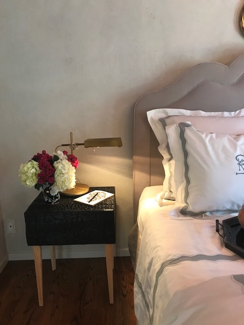
The plastered walls, painted ceiling, charred nightstands (yes they're made from charred wood people... REAL cool - there was a flipbook that took you through the process), snake sculptures, a hand-painted fresco & a dramatic Paul Ferrante candelabra chandelier - told the story beautifully.

IMG_4181.jpg
 
IMG_4182.jpg
 
IMG_4183.jpg
 
IMG_4248.jpg


The terrace made you take a pause and enjoy the breeze. The pod benches were suuuuuuper comfy. And I loved the sconces by Urban Electric. 
 
IMG_4213.jpg
 
IMG_4212.jpg


The Lady Cave by De La Cruz Interior Design felt like a fun, cozy space to relax and entertain in.  (Square footage wise it may have been one of the bigger rooms in the house, but it FELT intimate because of the way it was designed). 

 "The hug of the house" is how Heidi Schwarz from DLCID described it & it did feel like one. Moroccan fabric tented the room, and these deep, tufted velvet sofas set the tone of the space  I liked the little bulbs from Urban Electric tucked in the fabric - real cool.  It had that bedouin, Middle Eastern vibe to it that reminded me of old Dubai (my hometown!).  And very aptly,  they had a visual of present day Dubai playing on TV.

Photo by SF Curbed

Photo by SF Curbed


IMG_4299_edited.jpg
 
IMG_4304_edited.jpg


A room I loved for it's serenity - this ocean retreat bedroom by Eden Wright Design.  It had soft wall-to-wall carpeting and a supremely inviting chaise lounge (I could read a book or two lying here). Check in your tech at the door and step into this space to de-stress and take in that spectacular view!   I LOVED the window treatments in the room and the way the same trim fabric was used in different areas of the room, tying it together.

IMG_4235_edited.jpg


If you're looking to indulge your inner design child this weekend, and have fun while at it,  go check out the showcase! :)  Make a day out of it at the Marina.  And if you do, let me know your thoughts &  your favorites. 

My Version of Heaven

I just experienced the most heavenly room.   

Dina Bandman's nursery at this year's SF Decorator's Showcase has the one thing I love about great design - it tells a story.  I'll cover the showcase in my next post, but I wanted to highlight and discuss this one room today as it really had my heart.

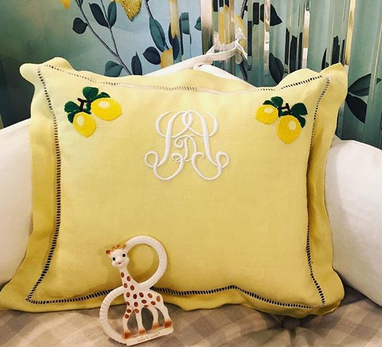
One of the first things I tend to notice when I enter a space is - how does it make you feel? And "Lemondrop Lullaby"  felt like I'd just stepped into a cozy, comfortable, zesty wonderland.  It really just envelops you.

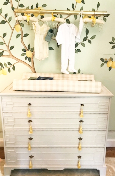
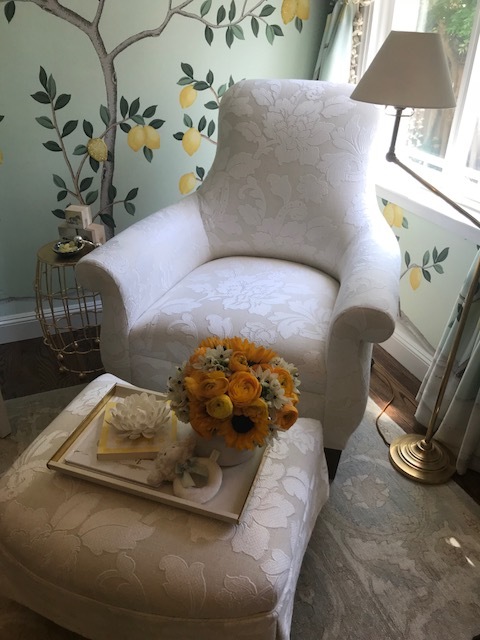
Dreammmmmy wallpaper,  a lucite crib that looked next-level amazing, perfect hardware, lattice work on the ceiling, a revitalized vintage dresser, and the most adorable scalloped curtains evers. Flawless right down to the last detail.

lemondrop lullaby.PNG

I know guys, take a moment. Just take a moment. 

LOVE with the crib. There could not have been a better choice  & it complements the lemon tree wallpaper (custom designed with de Gournay) to perfection. 

IMG_4280_edited.jpg


A close up of bead work on the wallpaper. It's great how de Gournay aims to surprise and delight with a new technique each year! (last year it was with embroidery)

 
IMG_4193.jpg


Impeccable handmade linens by Julia B

 
custom pillows.PNG


Super pretty Tiffany wall sconces (designed by Sabrina Landini). Cinched with a band of mirrored glass. 

 
IMG_4255_edited.jpg


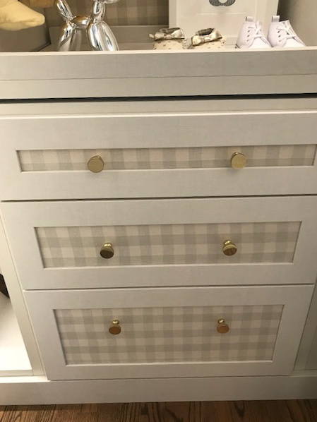
I loved the gingham in different parts of the room.  On the changing tray and inside the closet.

IMG_4258_edited.jpg
 
IMG_4195_edited.jpg


Who wouldn't want to play,  nap or read with baby in this cozy corner?  :)

IMG_4194.jpg


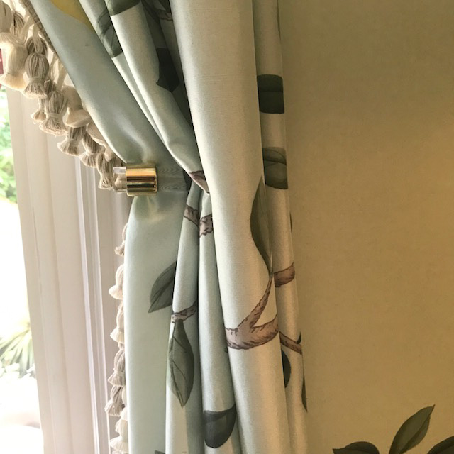
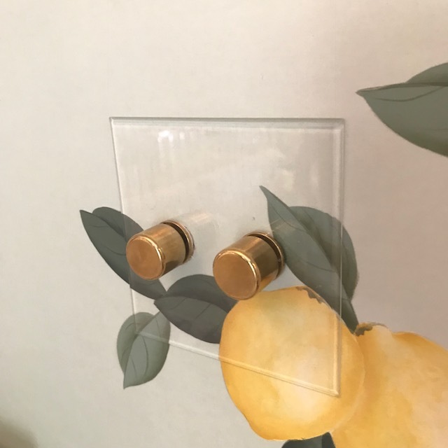
The gold & lucite hardware throughout felt cohesive and gave it a touch of glam. Holdbacks & light controls. 

IMG_4199_edited.jpg


A wardrobe right out of my nursery dreams! The onesies are adorable. And did you spot the lemon dividers?  I love that they went the extra mile on every last detail.

 
IMG_4275_edited.jpg
 

Who else wants to now move into this room? Maybe we can petition our way into it :P


The showcase runs until May 29th so if you want to experience it in person, hurry, hurry.. The house is in a great location too, in the Marina.  Here's details!

I was thoroughly inspired by a lot of the rooms this year. More coverage in my next post, stay tuned! 

Finds From My Recent Design Jaunts

Lately I've been going on quite a few design jaunts for projects and personal stuff and I've been seeing some awesome spring-summer finds and furniture pieces as well, at local shops.  I discovered Tuesday Morning on Blossom Hill which has the cutest stuff! Everything from bedding to small furniture pieces to accents, I liked their selection and mix of styles.  I also spent a few hours perusing through shops in downtown Menlo Park and made some fantastic finds there too (albeit pricier but a great value). There's lots I wanted to take back with me but had to resist!  Living vicariously through the blog and sharing all with ya'll here!


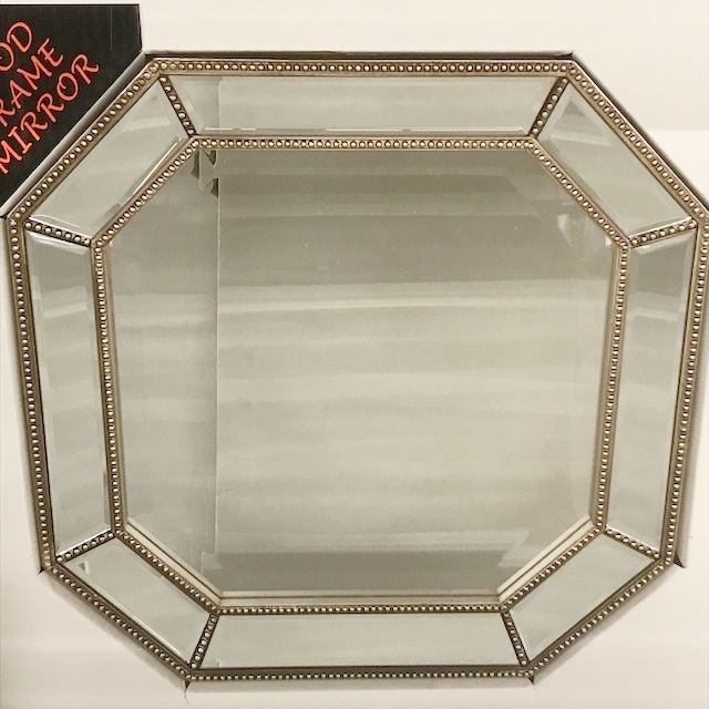
An octagon beaded mirror - yes please!  A pair of these on either sides of the bed would be a great way to bring in the glam

 
IMG_3931.jpg
 
octagon mirror.PNG


In LOVE with these counter stools at Tuesday Morning.  The rope fabric and nailhead trim is perfection. I wish I had some place to put 'em! And a bench in the same fabric.

IMG_3945.jpg
 
IMG_3949.jpg


Spring pillows!  Love the metallic one with the squiggly lines, which felt Jonathan Adler-esque to me for some reason. 

IMG_3956.jpg
 
 
IMG_3958.jpg
 
jonathan adler snake tray.PNG
IMG_3947.jpg


Great neutral throws - golds, greys and whites

 
IMG_3952.jpg


A soft white chevron rug - great as is for some contemporary style, or layered with faux cowhide to warm it up a bit

IMG_3944.jpg


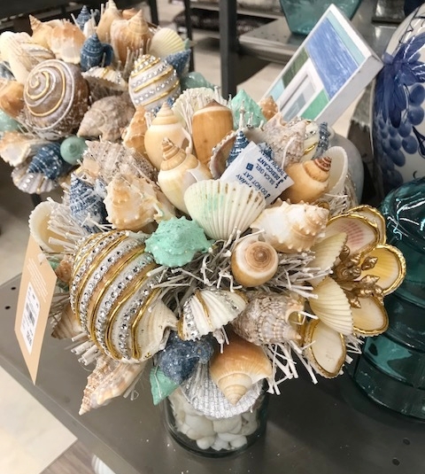
Beach house accents anyone? :)

Striped patio pillows & natural fiber bags. And shell bouquets that looked STUNNING in person - coastal with a little bit of shimmer and shine!

IMG_3968.jpg
 
 
IMG_3969.jpg
 
IMG_3967.jpg


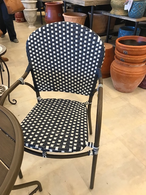
French country bistro chairs. Also  great for a breakfast nook 

IMG_3970.jpg


This herringbone cabinet would be perfect for small space storage, I can picture it as a sideboard in a small space dining area.  Top with some simple white vases with leaves and branches and you have a moment!

IMG_4068.jpg
 
white vases with branches.PNG


And some sightings in downtown Menlo Park,

...a grass cloth dresser - which I loved to pieces, and which also cost an arm & a leg!! Needed a little wipe down but it was in great shape otherwise.

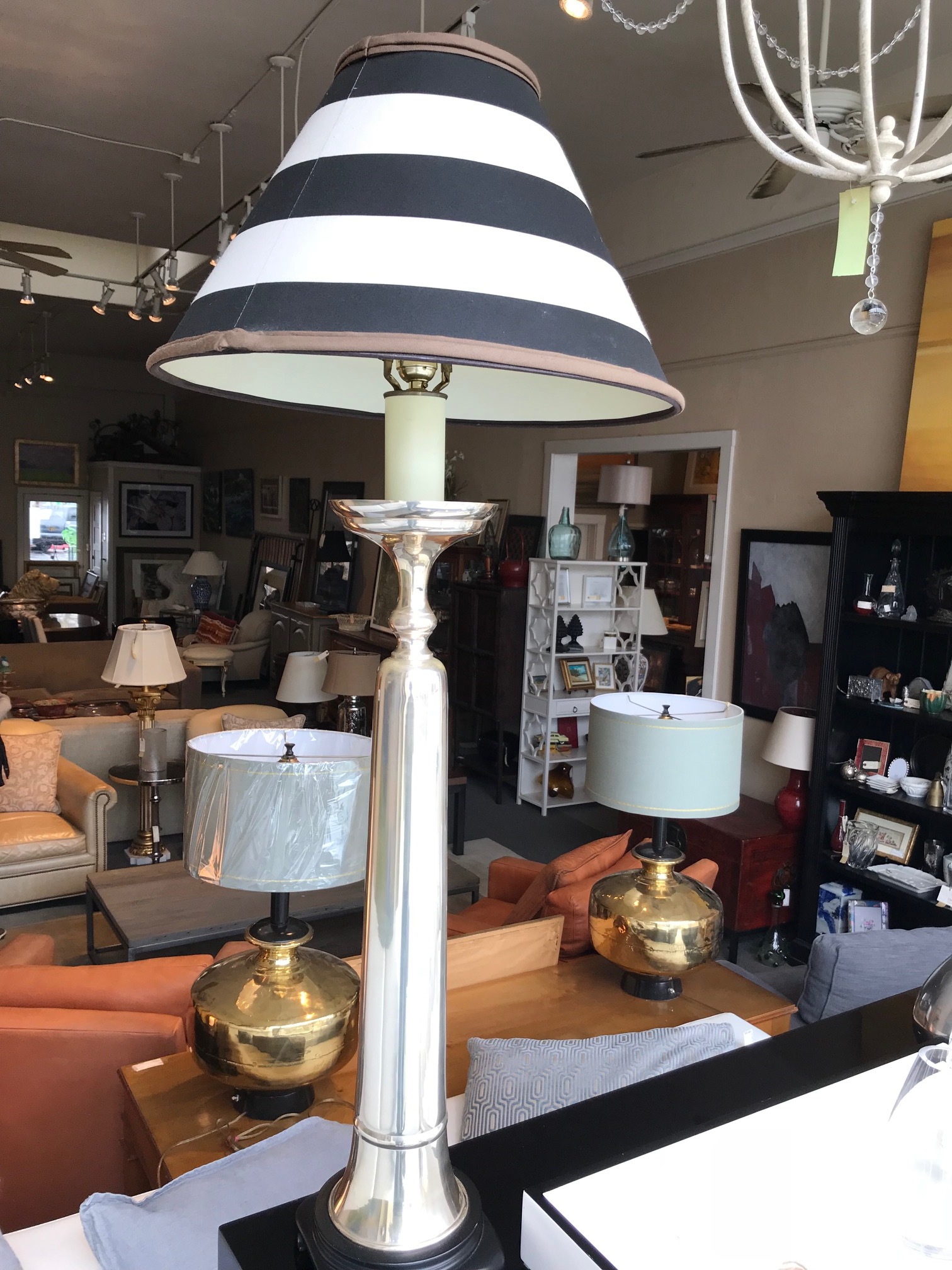
... this striped table lamp is everything. It would look amazing in an otherwise traditional room. Statuesque and beautiful.

...a cozy chair and antique table lamp - reading corner essentials!

IMG_3672.jpg
 
IMG_3678.jpg
 
 
IMG_3681.jpg


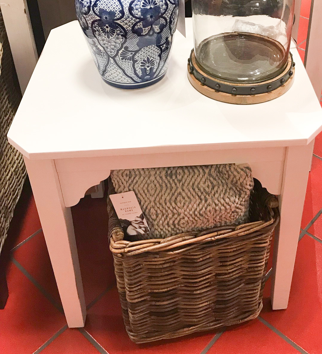
And lastly, some classic coastal furniture at Pier 1 - this chair was super comfy. And I spotted these cute white end tables - love the carved details!

IMG_3565.jpg
 
IMG_3563.jpg

Floored by It

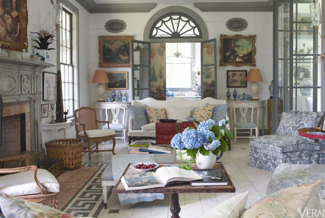
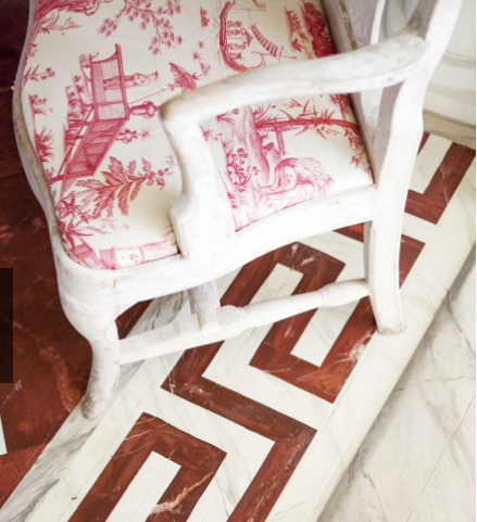
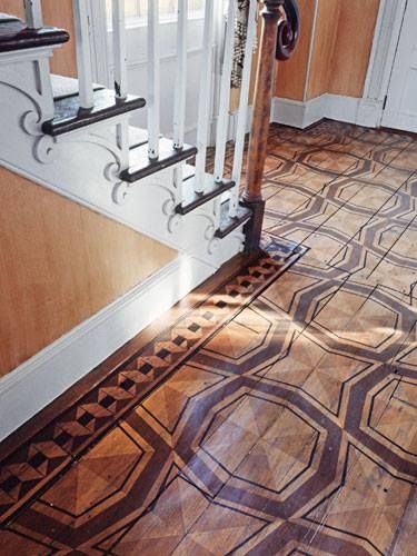
I came across the beautiful home of designer/antiques expert Furlow Gatewood  in Veranda recently. WHAT. A. HOME.  It's a home that demands close examination and I'll do a whole other post on it in the future.  But one of the things that caught my eye in these pictures were the beautiful painted floors! (close ups below).

I had to explore all things painted floors & made some great discoveries along the way.  Stenciling or hand painting, when tastefully done, can give even ugly / boring floors an incredible face lift.  And for a fraction of the cost (and a relatively quick process) than if you were to gut and replace them.  Not only to cover up an unattractive floor, one of my favorite designers and design great, Bunny Williams,  uses this technique effectively to enhance an entry or a living room.

There's actually a few great options for floor stenciling on the market today & I've shared them  below.  Young House Love did  a FANTASTIC in-depth write up  on how they stenciled their closet floors (a 2-day project - pretty cool!). I highly recommend reading it if you're looking to give it a go in your home. 

In my research, I was particularly drawn to rooms where the flooring fills up the space & sets the tone for the room, without overpowering it. Sharing a few snapshots and sources below -


Greek key border floors in the home of Furlow Gatewood. I love the marble-esque texture to it (it's all paint on hardwood floors people!)

painted foors - fireplace surround - furlow gatewood.PNG
 
 
furlow gatewood - greek key 2.PNG
 
furlow gatewood painted greek key flooring.PNG


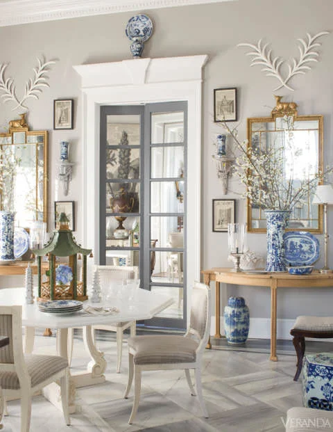
Another Furlow Gatewood vignette - someone please transport me to this room!  The painted floors, blue & white china, door surrounds, and stunning leaf decor - I know we're talking floors here, but man, just look at this room.

Furlow-Gatewood-Veranda-.jpg


Something  more contemporary - this trellis pattern  by Anna Louise - she transformed "depressing dark vinyl floors" into THIS.

Stenciled flooring.jpg


Stenciling  in progress (they've used a brush, and I've seen small paint rollers used as well)

stenciled flooring in action.PNG


A checkered entry - Bunny Williams

bunny williams painted floors checkered.PNG


A tortoise shell pattern that Bunny designed for an entry

stenciled floors bunny williams.jpg


Geometric floors in the kitchen - a great choice of color in that silvery grey

light grey diamond pattern - subtle flooring.PNG


Mirth Studio makes beautiful hand painted hardwood tiles. How fantastic are these! Lots of fun patterns & colors and they create custom designs as well.  The little helper to the right - came across on their Instagram

 
mirth studio handpainted tile choices.PNG
 
mirth studio handpainted floor tiles - little helper.PNG
 
mirth studio handpainted wood floor tiles.PNG


Some whimsy up the stairs! 

mirth studio painted stairs.PNG
 
mirth studio painted stairs 2.PNG


I love this room and it's blue floors.

Bunny Mellon - painted floors.PNG


For some pretty, traditional patterns, take a look at Royal Design Studio

 
royaldesignstudio blue & white.PNG
 
royaldesignstudio floral.PNG


Have a great weekend everyone!