A Timeless Classic

Schumacher's Pyne Hollyhock is a bit of a legend in the design world. A timeless classic that instantly resonated with people when it first burst on to the scene in the 60s, and to this day graces the windows, walls & furniture of so many beautiful homes! 

I recently saw it featured on the cover of Schumacher's winter issue of The Bulletin (pic below) - and was floored by the simple warmth of the space and it's pairing with the striped chairs. Stop-in-your-tracks gorgeous.

Schumacher did a feature on Pyne Hollyhock & Nancy Pyne, whose home it was first introduced in. Famed designer Albert Hadley sourced this floral chintz for her home from England. Chintz wasn't in fashion at the time, but for Pyne it was love at first sight -  "My friends and family said "No, no no!" But I said "Yes - I like it."  

It was cool to read the origin story of this gorgeous pattern & I enjoyed reading about Mrs. Pyne herself!  Including her maxims for a well-lived life. My favorite - "You've got to never think about yourself, never, and you've got to think about other people".   Clearly, she's a lady with great style AND a force to reckon with.

Because of it’s popularity, the Pyne Hollyhock is an excellent study in how a pattern as exquisite as this can be applied in different ways in a home. Let's explore!


image1.jpeg


Nancy Pyne in her home at Cherryfields, 1987

nancy pyne vintage.PNG


... in her current home.  Style that endures.

nancy pyne current.jpg


In it's original color, charcoal.

 
pyne hollyhock.PNG


Traditional glam. Love this mix of elements. A small sunburst mirror, leopard pillows & that exquisite Hollyhock headboard.

headboard.PNG


Powder room envy!!  

powder room.PNG


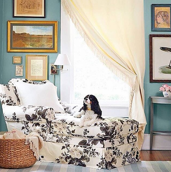
This pup is clearly living her best life

chaise.PNG


One of my favorite applications - crisp Louis XVI chairs

king louis chair.PNG


On a throw pillow,  a nice pairing with the bottle green

pillow.PNG
 
pillow pairing.PNG


And finally, this dreaaaaaaamy bedroom (designed by Erin Gates Design) that has my name written all over it!  Modern elegance. I love how the swirly marble lilac pillow (modern) complements the grisaille wallpaper (a classic). 

wallpapaer elegance.PNG


Photo Credits: F. SchumacherThe Glam Pad, Laura Design Co,  Schumacher Instagram - 1, 2

Our bedroom

A few posts ago I’d shared the plan for our bedroom and the elements I was looking to bring into the room. Well, here’s a few snapshots as it stands today! Still some things to add (runner, wall art etc.), but thought I’d share a few glimpses with ya’ll.


The bedside. Framed cuts of Thibaut’s Giselle wallpaper which I fell in love with. I knew I wanted to have it in the room in some way. So serene and beautiful. I love waking up to these every morning!

beautiful framed wallpaper.jpg

The white nightstands I’d picked up at a vintage shop (originally black) and refinished with white paint and adding on these cool brass ring pulls.(here’s how I went about it)

A wide shot of the room (excuse the lighting & styling - it’s not the best!)

serene bedroom.jpg

Love these crystal lamps. And one of my favorite books (which also makes for a a great accent because of it’s chic jacket) “I Married Adventure”.

bedside accents.jpg

Instead of the trio of sunburst mirrors, I decided to go with a pretty antique gold Victorian mirror.

antique gold mirror.jpg

Love these abstract seascapes in simple gold frames.

abstract seascapes.jpg

The quatrefoil bordered bedding I’d found at a local discount shop. (By “local” I mean it was still 50 miles away and my sweet husband and I drove over to pick it up as they had only 1 left & it was at that location. And our car broke down on the return!) Ha ha, makes for a good story. I love them so much!

details.jpg

Weekend Project Success

As you guys know, I'm really into Bungalow 5's Jacqui nightstand at the moment. It's clean lines and gorgeous turned legs -  a great example of  traditional design that feels fresh and current.

image5.png

But they're priiiiiicey people! and would definitely bust our budget. So I decided to look for something with a similar style and feel, and that would look good in our bedroom.

I checked out  sites like Chairish & design + gallery which have quality vintage & designer pieces, but I wasn't finding anything that felt like a good fit.  And then, just as if they were in my destiny.....

... I stumbled upon this FANTASTIC pair of ming nightstands right here at a local antique shop!  Clean lines, a beautiful carved base & in great shape. And they were a pair (rarer than you'd imagine!).  Sometimes you walk into a place and come upon a real treasure & you just gotta go for it!  But me being me, I still gave it a day's worth of thought  & whipped 'em up the next day.

image6.jpeg


I considered having them professionally rejuvenated / refinished, but honestly they were in very good condition so I decided to give 'em a go!  They needed some love to smooth out the surface and fill in a spot or two, which I felt  I'd be able to manage. 

The following weekend I bought white spray paint and ordered 6 polished brass ring pulls. Sanding, priming and a few coats of spray paint later....ta-da!


image3.jpeg
 
image2.jpeg
 
image4.jpeg
 

I left the insides of the drawers a rich stained oak that they already were.  It makes for a nice contrast and gives the stands a little edge.

I'm THRILLED with how they've turned out you guys!  They look great in our bedroom and lend it such a charm.

I used Rust-oleum's white primer and gloss white spray print, and Minwax's semi-gloss polycrylic to seal it off.   All great choices & I'd definitely recommend them for any spray paint job you have coming up. I prefer semi-gloss for an understated look (especially with polished hardware). High-gloss if you're going glam or ultra-modern.  

 For someone who's not a major DIY-er, my DIY confidence is soaring right now! :P

The Plan for Our Bedroom

We've been wanting to refresh our bedroom for the longest time and I'm excited to finally  make it happen this summer. In the mood for some change and making our room feel more "us".  Plus it gives me a chance to experiment! I wanted to share the space and plan with you'll as it comes to life.

Here's what I know I want for our bedroom.  I want it to feel really SERENE.  A place for us to relax, retreat and de-stress in. Muffadal & I are both drawn to blues, and it's a super calming color so I want to bring blue hues into the space.

Design-wise, there's one thing and one thing alone I've been ABSOLUTELY SURE about from the start - a pair of gorgeous framed wallpaper panels running up the sides of the bed. I've been perusing Pinterest and other sites for inspiration for months, and I'm SO in love with the wallpaper I finally decided to go with!  Thibaut's Giselle in blue & white.  I fell for it the second I lay eyes on it.  And it actually became the jumping off point for the rest of the scheme.

 
Thibaut Giselle - Blue & White.PNG


Because we're living in a rented apartment, there's a few limitations we're working with - 
White walls - While I really want to paint the walls, it doesn't make much sense to do that right now, because we'd have to repaint it to it's original color before we move out.  But if I could, I would've gone with a muted grey like Farrow & Ball's Cromarty or Sherwin Williams Knitting Needles.

 
Paint Color.png
 

No ceiling fixture -  Our bedroom does not have a ceiling light, which is totally fine, but man, would it have been awesome to have a pretty chandelier staring down at me every morning! :)  
Budget - We're decorating on a budget. This isn't our permanent home, so we didn't want to spend a ton of $$$ on it right now. There are 1-2 larger investment pieces I'm really keen on but we're going to hold off on them until we're in a more permanent space. Better to wait then spend in the  short term on something you don't completely love! 

At the same time, I still wanted to decorate our current room with things that I love & that we could carry over to a future home. 

So here's the plan - 

final scheme.png

wallpaper - Thibaut's Giselle in blue & white 
bedding  - bordered sheets,  euroshams - quilted,   throw - cashmere, spa blue
end tables - I am obsessed with these Bungalow 5 Jacqui end tables, love their gracefulness and the turned legs (but oh, that price!).  
Will have to hunt for something similar!
table lamp - clear, tapered crystal lamps
rug - most likely a bleached jute - because we have a darker wall-to-wall carpet already.
curtains -  Ikea's Merete for the win - a heavy fabric that looks more expensive than it is & holds up well. Also, a great length (98") if you have high ceilings like we do. 
natural fiber basket - rattan, wicker or hyacinth
mirrors - 2 options I'm considering - a trio of small antique gold sunburst mirrors or these round gilt mirrors from Pottery Barn
art - when hunting for tranquil art, I came across The People's Prints on Etsy. Love their water color abstracts in pastels. , framing -  matted, brass

I'm so excited to see it come to life!!!