Day 6: Chandys for the win

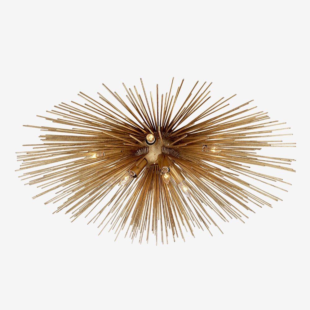
2 contemporary chandeliers I’m loving right now.


1. Sea urchin by Coup d’Etat. Used masterfully in this room (spotted in luxe). Love how the contemporary chandelier compliments the traditional suzani on the bed!

sea urchin chandelier coupe detat.JPG
chandelier+suzani.jpg

2. Muriel by Oly Studio - This one’s fiiiiiiiiine to another level. A beautiful transitional chandelier. It brings the excitement to this dining room designed by Hudson Interiors. A great palette too - green, white, woods & brass - always uplifting, always beautiful.

muriel cloud chandelier.JPG
 
green white wood.JPG
 

Day 5: That view!

A couple days ago I was looking at a few nature pictures online and came across this lovely shot of summer in the Olympic National Park in Washington. Stunning, isn’t it?

Photo by Jason Horstman (www.sharetheexperience.org)

Photo by Jason Horstman (www.sharetheexperience.org)

Experiencing summer in the mountains would be amazing, especially with nature coming out in full force right now. Imagine being in the great room of Reid Smith home, with dramatic floor to ceiling windows, and that spectacular view.

Whew!

Reid Smith Architects

Reid Smith Architects

Here’s elements I’d pull together in a great room like this - bright furnishings and warm accents to compliment the peaks outside -

mountain house chic 3.png

sofa - RH tuxedo sofa (2 for a room this size)
sofa pillows & throw -
indonesian ikat , off-white velvet, faux snow leopard throw
armchairs -
vintage Paul McCobb, reupholstered in a brighter cream wool
armchair pillows -
indonesian ikat lumbar pillows
coffee table -
live edge coffee table w/ acrylic legs
side tables -
white linen side tables
table lamps -
Kravet Curated - Bianca
rug -
rustic patchwork rug
accessories -
hurricanes - similar, coffee table book, coconut inlay box, african cowry shell neckpiece on stand (a favorite! - these tend to be hard to source out…from antique shops)

Day 4: Drama in the bedroom

Something I’m currently drawn to - statement upholstered headboards.

While the end results are gorgeous, they do tend to be expensive to make. Having a headboard made with a professional workroom can be upwards of $1K (making charges only, add on fabric!). Much more for larger sized beds. But it is possible to get it made for less, with a local craftsman willing to take on the project, or DIY it if you’re so inclined, using fabric and a staple gun (here’s a great DIY guide on how to make one).

And here’s 4 ways to do a dramatic headboard!

Upholster in a vibrant fabric. These twin beds are upholstered in Quadrille’s iconic Kazak (via Quadrille )

Upholster in a vibrant fabric. These twin beds are upholstered in Quadrille’s iconic Kazak (via Quadrille )

 
Add on a welt trim to punctuate the shape of the board (via Arent & Pyke)

Add on a welt trim to punctuate the shape of the board (via Arent & Pyke)


Add on a contrasting trim. Love the effect, and on an aside, I’m loving the earthy tones in the room (via Coastal Living)

Add on a contrasting trim. Love the effect, and on an aside, I’m loving the earthy tones in the room (via Coastal Living)

 
Repeat the headboard fabric (if it’s a softer pattern like the one above) in other areas of the room. Like here it’s tied in with the window treatments. The repetition completes the story beautifully (via Anna Burke Interiors)

Repeat the headboard fabric (if it’s a softer pattern like the one above) in other areas of the room. Like here it’s tied in with the window treatments. The repetition completes the story beautifully (via Anna Burke Interiors)

Day 3: My current favorite room on the internet

And here she is.

emily butler bedroom - head on.JPG

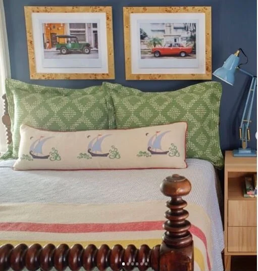
This warm and inviting nautical bedroom by Emily Butler is everything I love about great interior design.

It’s classic.
It’s layered.
It’s FUN.
It’s livable.
It’s what you’d call comfortable elegance!

Another view of the room.

emily butler bedroom.JPG
emily butler bedroom - right side.JPG


So what makes this room special?

  • It feels more carefully curated than decorated. This may be why I love it so much.

  • That spindle bed - an antique - is beautiful

  • Love the nod to nautical style with the Katie Ridder - Beetlecat lumbar pillow & striped Pendelton throw

  • The throw complements the shams (Sister Parish Pocantico in Fern) and the red table lamp, and ties in all the colors nicely

  • Speaking of which… that lamp! It’s such a happy color. Try to picture the room without it…it doesn’t feel quite the same. The lamp brings that cheerfulness. A great example of how a pop of color with an accent or an accessory can change the energy in a room.

    (I learned from the designer that they has to replace the red table lamps with blue anglepoise desk lamps (pictured to the right, above) because of a small accident.Still cute!)

  • The end tables on either side of the bed are different, which imho, adds to the charm. Collected and gathered, rather than decorated. Everything doesn’t always have to match. Particularly love the antique farmhouse table.

  • The burlwood frames above the bed are EVERYTHING. They look amazing against the blue wall. And I love the prints of the vintage cars as well.
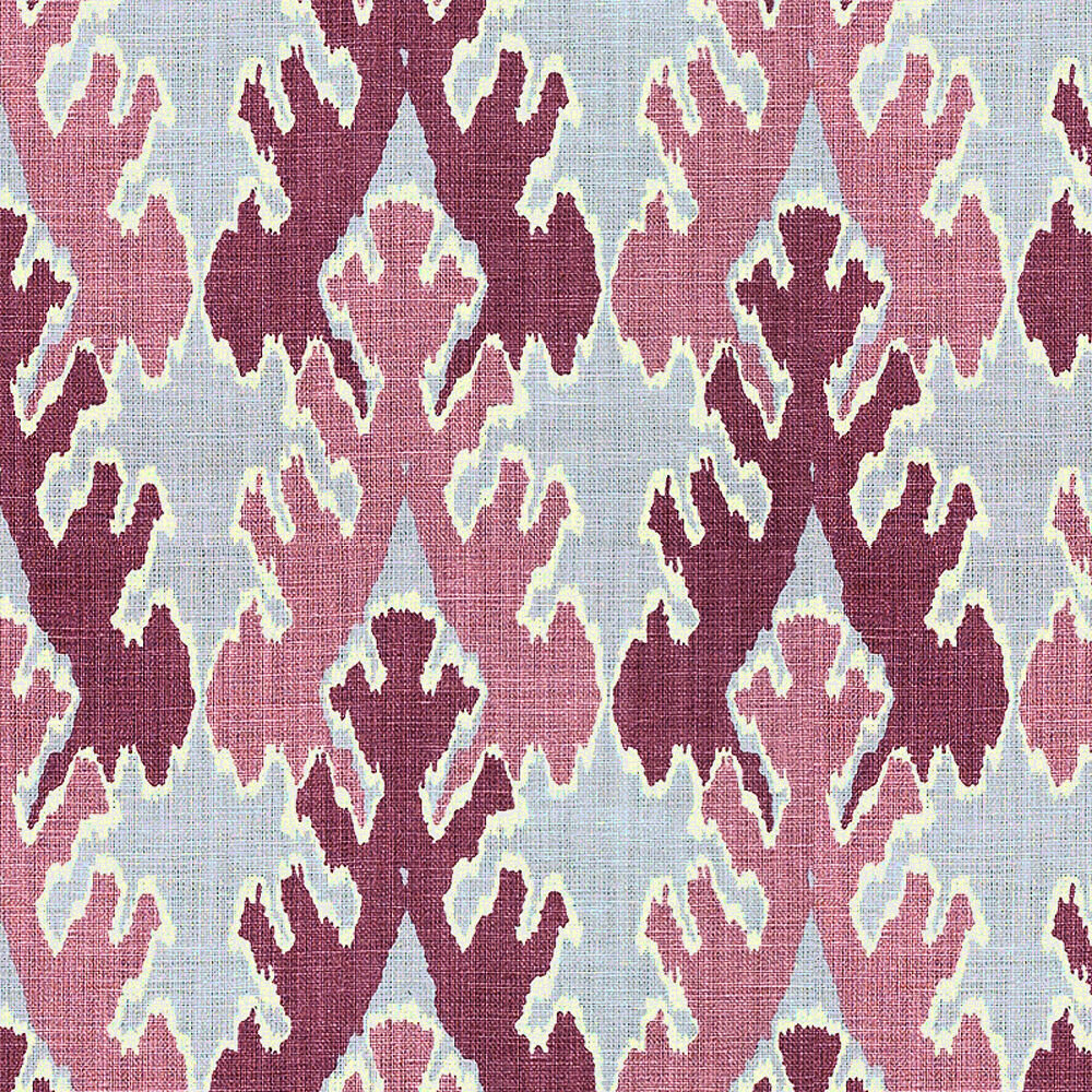

Here’s some high-low finds to achieve a similar look -

get the look - nod to nautical.png

Day 2: Risk-taking with Kelly Wearstler

I recently took a Masterclass with Kelly Wearstler which was both fun & useful (especially her lessons on materiality, and using the history and surroundings of a space, to influence its design). You need only glance at Kelly’s portfolio to get her amazing sense of materiality, space, storytelling, and her ability to combine objects in ways that feel new to the eye. Her projects are her playground, and Kelly it’s master conductor.

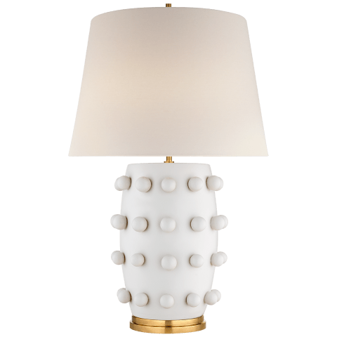
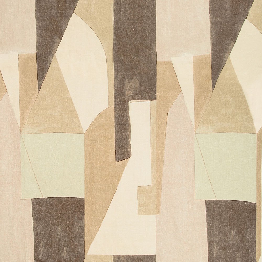
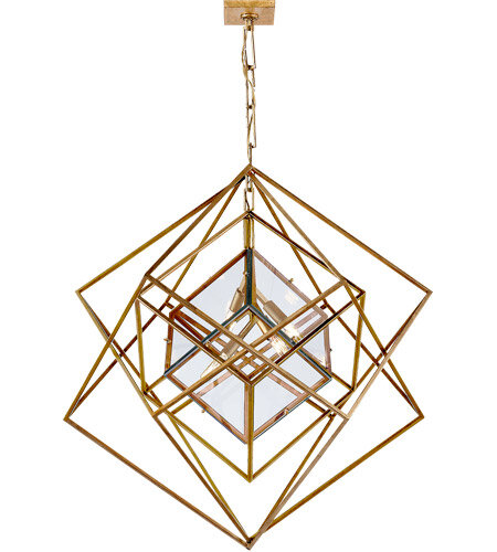
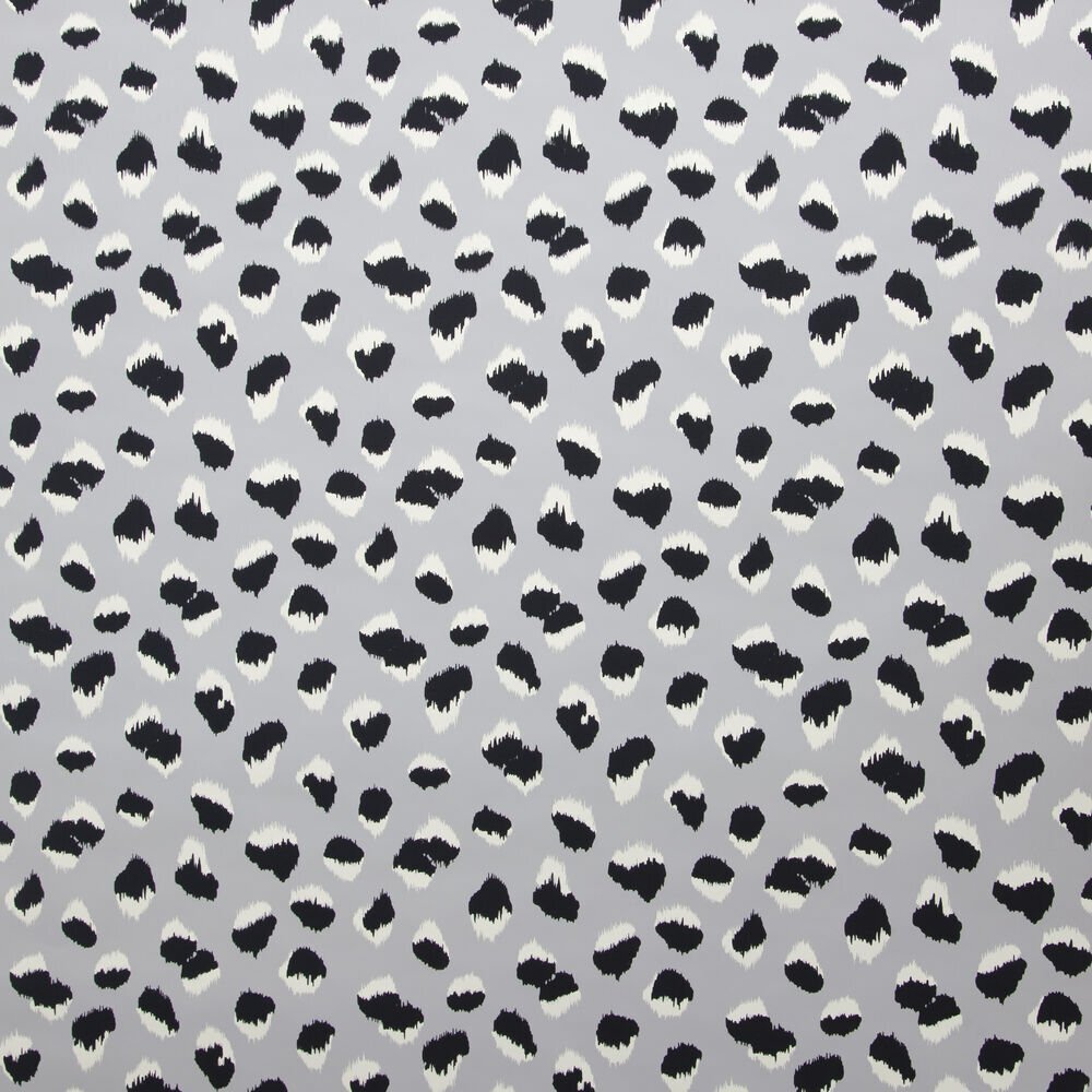
I’ve pulled a few vignettes from her portfolio that are inspiring to me, personally. And I’ve pulled a few favorites from her product lines as well. Particularly, wallpaper, fabric and lighting. They feel personal to her, and break through the clutter. Enjoy! :)

Love the eclectic mix of objects in this room. Feels like a collected space.

kelly wearstler collection of objects.jpg
 

An oldy but a goody - her iconic brushstrokes wallpaper in this dynamic foyer. I realize it’s a little “out there” and it may not be everyone’s cup of tea (may be too “on the edge” for me too on most days), but somehow I really like it here in the stairway - its a risk that pays off, I think.

via Vogue

via Vogue


The Bergdorf Goodman restaurant overlooking Central Park. Elegance personified. Inspired by salons of the past. Love the powder blue and white colo scheme.

bg2.jpg
 
bg 1.jpg
bg 2 hooded bergere chairs.jpg


The Viceroy Hotel, Santa Monica.

I LOVE this wall of mirrors! Its commanding. And the oversized cameo and emerald chairs. They make a statement at the front desk.

viceroy santa monica front desk.JPG


OK. This. Is. Everything. The mural of white plates & furnishings against the charcoal backdrop is STUNNING. What a visual!

viceroy santana.jpg

A more recent work - the Proper Hotel in Santa Monica. She went with organic materials and vintage pieces for this relaxed, beachy hotel.

kw santa monica proper hotel.jpg

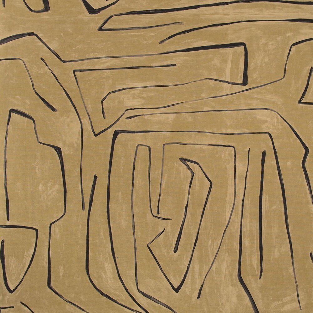
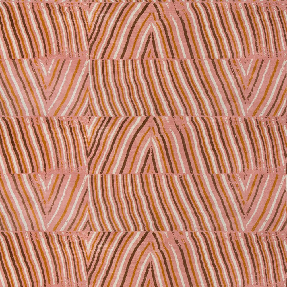
From Kelly’s product collections. Love the organic nature of these patterns.

0f4a12d7a16596b140e15a7ce0ebfa6a.jpg
 
 
kelly wearstler graffito.jpg
 

More from her product lines below! You can see it all here.