DESIGN

25 Beautiful Objects

I love this quote by Milton Glaser (who designed one of the most recognizable logos in the world - "I (heart) NY")

"There are three responses to a piece of design – yes, no, and WOW! Wow is the one to aim for."

I thought it'd be fun and insightful to start, by sharing with you, 25 beautiful objects to which my response has been WOW.   A treasure trove of beautiful things that left a lasting impression on me & that have a story to tell.

I'll share one each week!  Here goes... starting with  No. 25

25. The Boutis

French Marriage Boutis_Rideau de Paris.JPG


In the little apartment we lived in, in Provence, there was a lovely vintage boutis stored in one of the armoires.   It was absolutely gorgeous.  When I ran my hands over it, it felt almost sculptural. 

Boutis is a French art form that combines embroidery & quilting. Thousands of hours go into making ONE piece.

The effect it creates when seen against the light is magnificent! 

I love this marriage boutis (pictured above) made by the Rideau de Paris, with it's palmetto leaves & scalloped edges.  It would make an absolutely gorgeous wedding gift, don't you think? One for keeps.

Is there something that's WOW-ed you? Something you fell in love with at first sight? 


Photo taken from "A Home in Provence", photography by Christian Sarramon 


France Diaries - Part 1

I've wanted to go to France since the day my roommate back in college, handed me this delicious little book - A Year in Provence by Peter Mayle - and insisted that I read it.

I read it straight, in one night, and fell irrevocably in love. 

I imagined myself in this quaint village in the South of France.  Meeting the locals (like the eccentric butcher), going to it's cafes (Cafe Gaby, at the center of the village square, was my favorite!) and walking through its beautiful lavender fields. 

I decided right there and then, that I'd have to go here one day. For real. It went STRAIGHT to the top my bucket list!

Finally last year, in the summer of 2016 - it happened.. 

We decided our destination for the year was going to be France. We'd go to Paris, Provence & Nice. I was chief planner & scheduled a cool 5 day stay in Lourmarin...the French village of my dreams!

During our 13-day trip through France, I experienced so many different things, it's hard to put it all into words. It was like an art, design, nature.... LIFE awakening for me.  

From the style and charm of Paris to the quaint picturesque villages of Provence to the flirty little coastal city of Nice - I was blown away!

Paris and Provence left a HUGE impression on me. 

Paris was full of art & design inspiration. Provence set me free!
Paris filled me to the brim with an appreciation for Van Gogh & Monet. Provence took me to their source of inspiration - NATURE.
Paris left me stunned with the beautiful product packaging and window displays we saw there. Provence showed me THE. REAL. THING. - aromatic lavender and roses that literally melted my heart!

Paris had my heart. But with Provence I felt a soul-connect. 

This one trip taught me so much about nature, art, design, product packaging, gifting, fashion, presentation & great service. I took a ton of pictures & made lots of notes!

A few specific things left a huge impact on me. I thought I'd break it down and give you a fun, visual insight into them (with lots of pretty pictures!). 

In this post, I'll share with you,

1. beautiful window displays that had me do a double take!
2. some exquisite products & packaging

beautiful window displays

As we walked through the streets of Paris, we'd see one striking display after another. I noticed that my favorite ones were not the extravagant ones. But the ones that created a feeling of delight with simple elements.

#1  

Take a look at this display for Roger & Gallet's Rose perfume. It's a feminine, floral fantasy - the bottles perched amidst a field of pink rose pompons. It was gor-jus! and made me walk right into the store.

roger & gallet rose pompon window display 1.jpg

#2

Let's see if you can guess what  these are at first glance?

meats & roses creative window display.jpg

The display looked pretty from a distance... but what were they?


meats & roses creative window display 2.jpg

Meats & meat products! The red roses against the meat is GENIUS.

Imagine a bunch of boring meat stacked in there. You wouldn't give it a second glance! The roses do the trick. They had me do a double take. This was a delightful surprise in the heart of Le Marais, one of Paris' trendy/fashionable/artsy districts.

#3  

And finally, there was this dreamy display for Maille mustards!

Delicious looking mustard bottles against the backdrop of  a secret garden. The paper-cut garden has been inspired by Jardin's Secrets, a famous estate known for it's beautiful gardens.

Notice the "feel" this setup creates -  a fantasy garden you want to walk right into. Buy the mustard & you're there :)  Also the mustard bottles are adorable - those colors!

maille mustard window display.jpg

exquisite packaging

I saw some lovely colors in a lot of the product packaging in France. They tended to be a combination of pastel & pop colors. 

#1

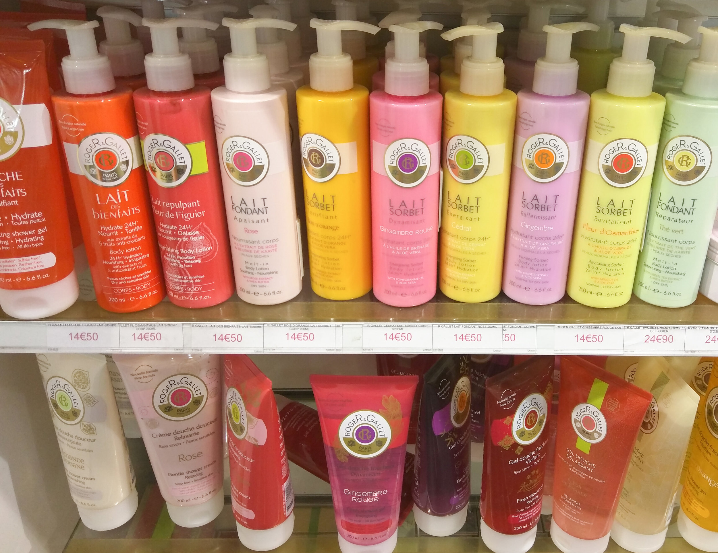
Case in point, Roger & Gallet scented lotions. Eye-catching from a mile away! A mix of mandarin yellow, leafy green, blush pink, peach & lavender.

#2

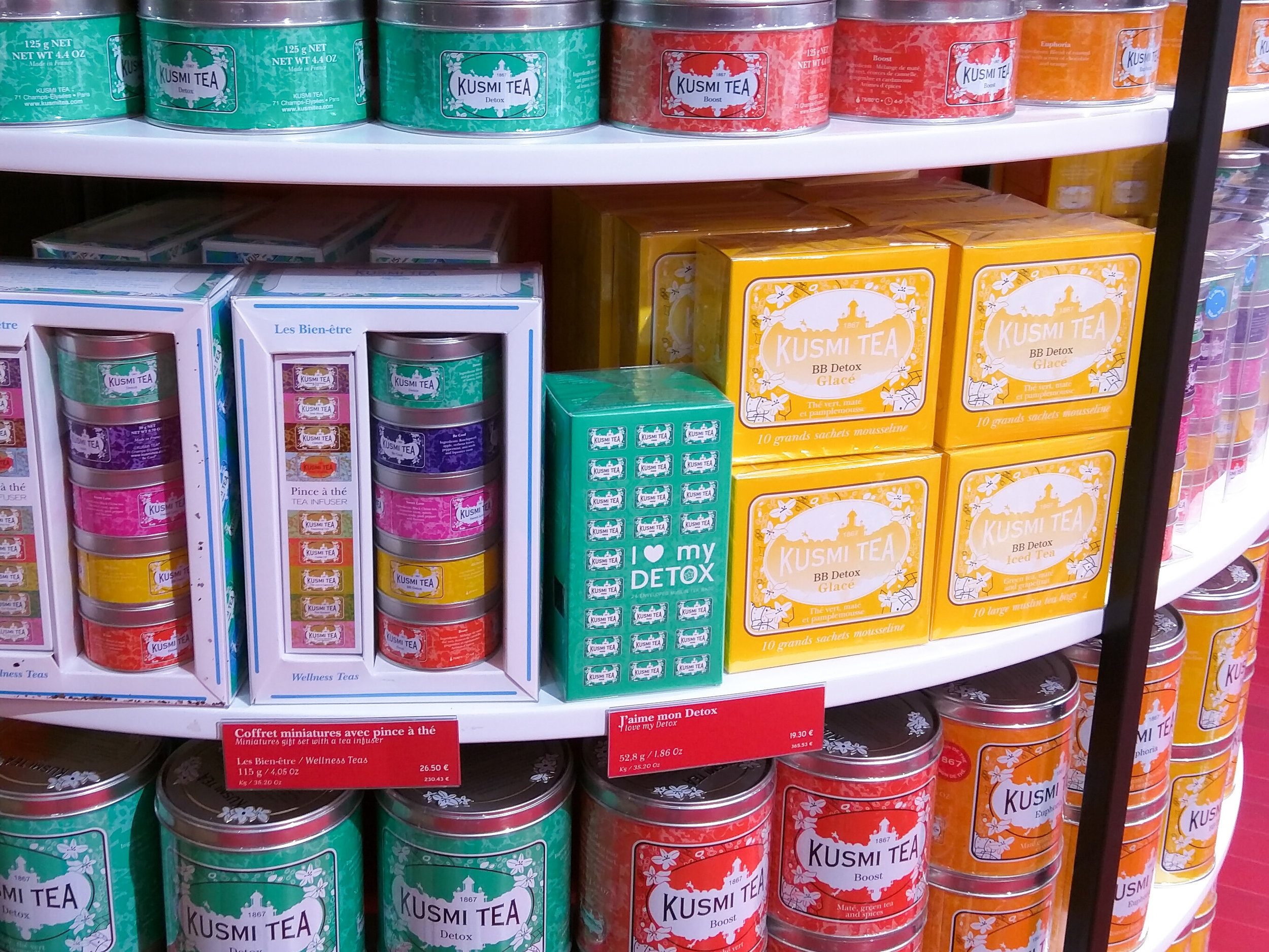
On the other hand, Kusmi Tea's packaging used striking colors - sea foam green, rani pink, deep water blue & bright yellow. It was a standout display and one I was instantly drawn to..

#3

 La Sablesienne's fresh, gourmet all-butter biscuits are packaged in a way that convey the brand's rich history. 

The biscuits had first been presented in The Royal Court of Louis by Marquise de Sablé in July 1670. And the recipe has been passed on from one generation of Sablé pastry chefs  to the next.

The round shaped tin box, with an elegant pink & gold Baroque design exudes old world luxury.

#4

One of THE most elegant packaging designs I came across, was this packaging of the Fragonard - Iris Perfume collection. I didn't have a good image so I pulled one off their site.


How gorgeous is this packaging!  We hung out in the Fragonard store for a good 30 minutes and kept coming back to THIS.  The scent is lovely, but it's the dreamy field of irises that take your breath away! 

Hopefully you got some inspiration & ideas from this post. Or even just enjoyed the visuals (I'm a sucker for beautiful visuals, and can spend hours looking at things, no jokes!)

Next week I'll take you to the land of my dreams - Provence. Stay tuned!


P.S. What do you enjoy about travelling? Is there something specific you've absolutely LOVED on a recent trip? Tell me about it!

Beautiful book jackets

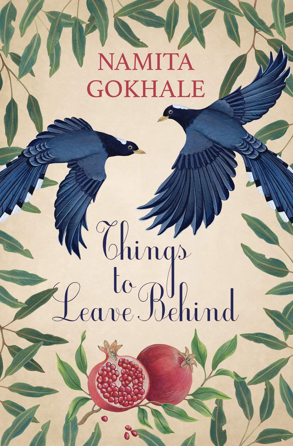
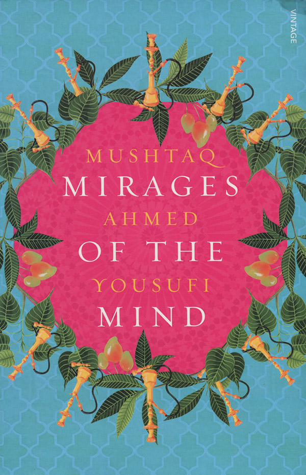
I want to live in a world filled with Charlotte Day illustrations. She's makes beautiful botanical art.

If you love books & you love botanical illustrations, you're going to love Charlotte's work. She designed the jacket for Jhumpa Lahiri's best-seller The Lowland and a few other novels too. 

Reasons I love them...
... the fantasy feel her illustrations create
... she tries to choose plants and flowers that encapsulate a character or place in the book, pretty cool
... her color palettes. There's quite a bit of color, but it's not overwhelming.

Enjoy :)

Is there an artist out there you love for their unique style or creativity?